Abstract.
Introduction.
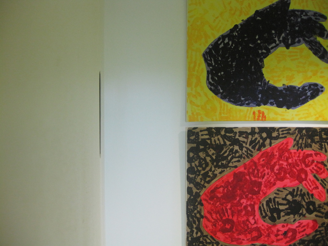
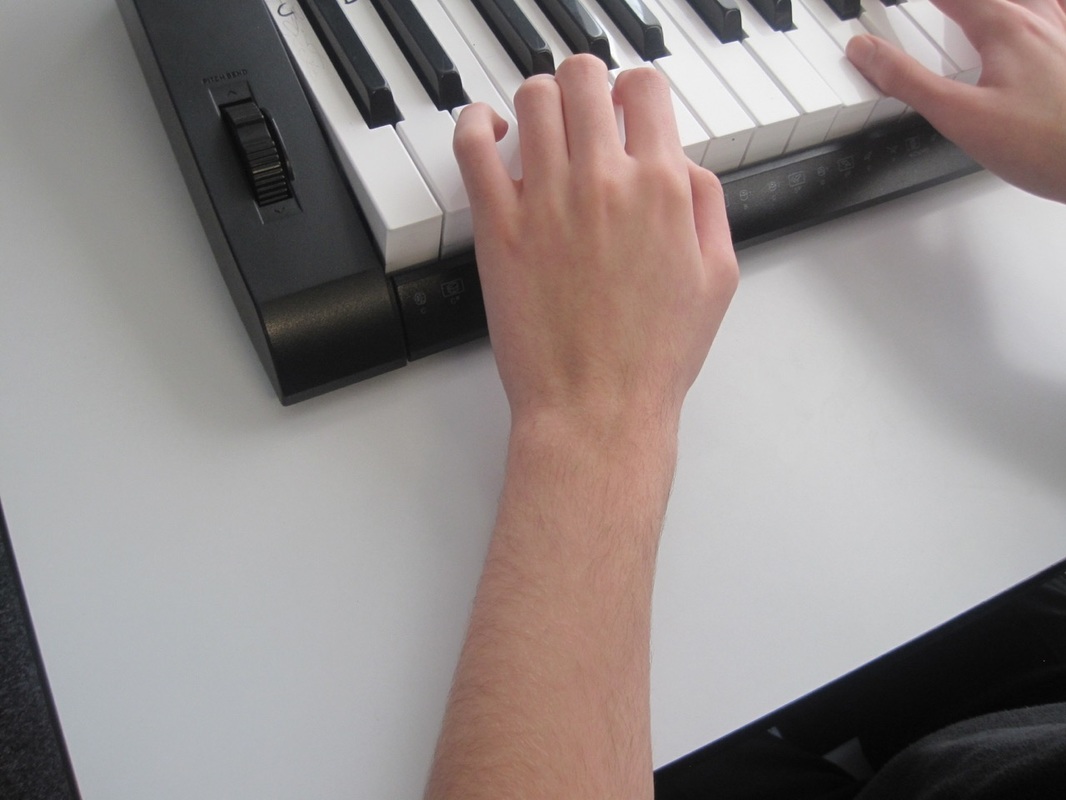
Most people say every piece of art is abstraction because they show a visual of life but not real life. Also people would say that abstraction is more naturalism then non-representation on one end. This project shows how the camera uses the formal elements of an image which the subject has the formal elements in place.
https://www.pinterest.com/tallisarts/abstraction/
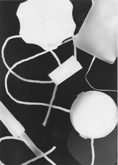
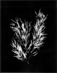
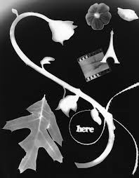
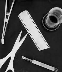
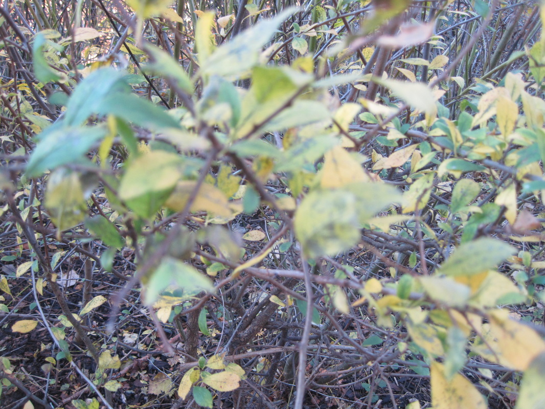
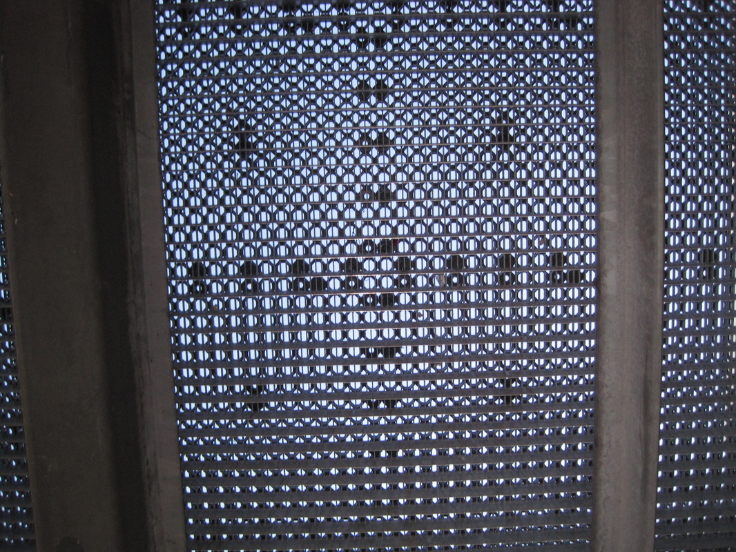
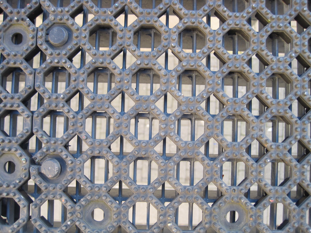
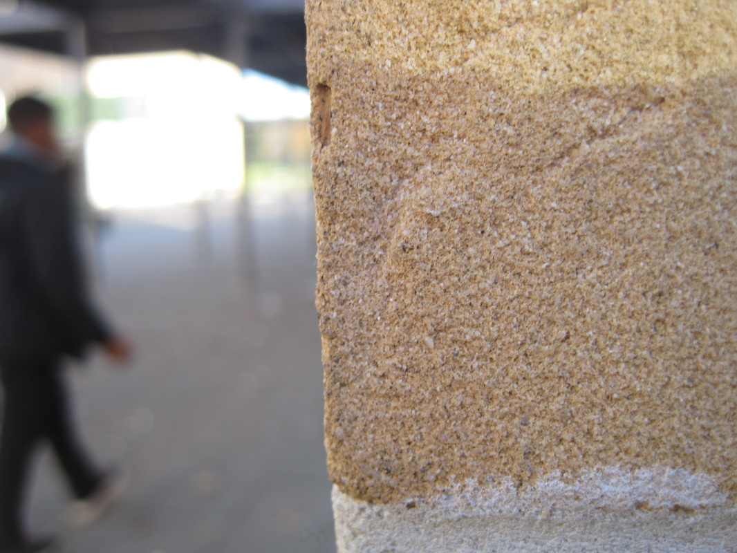
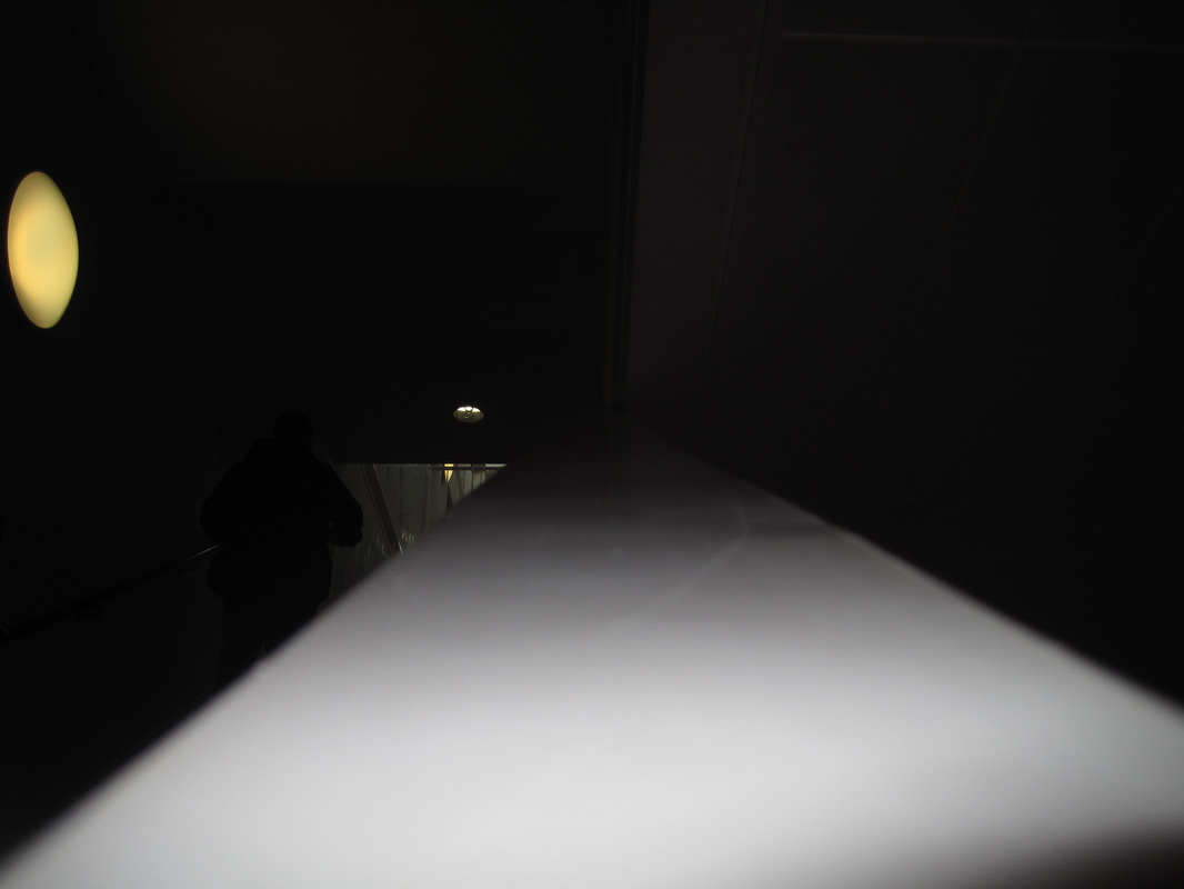
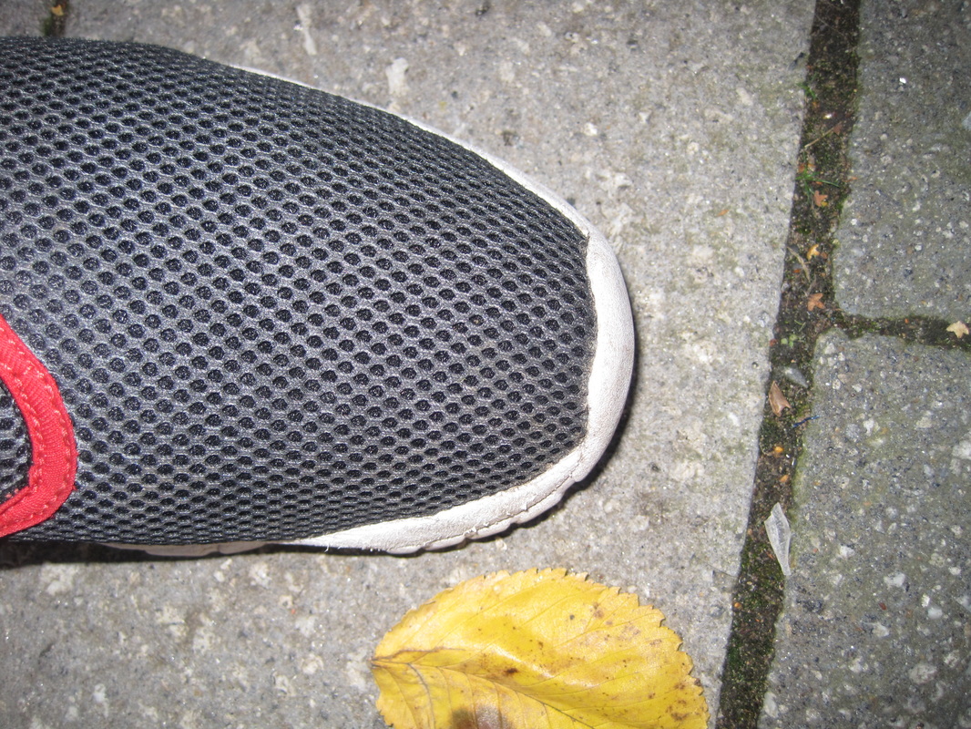
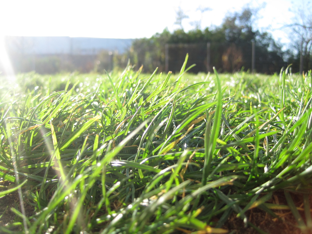
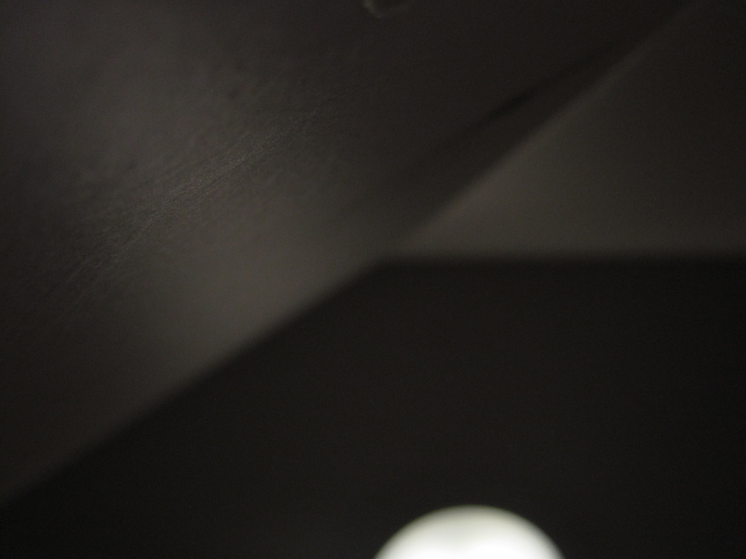
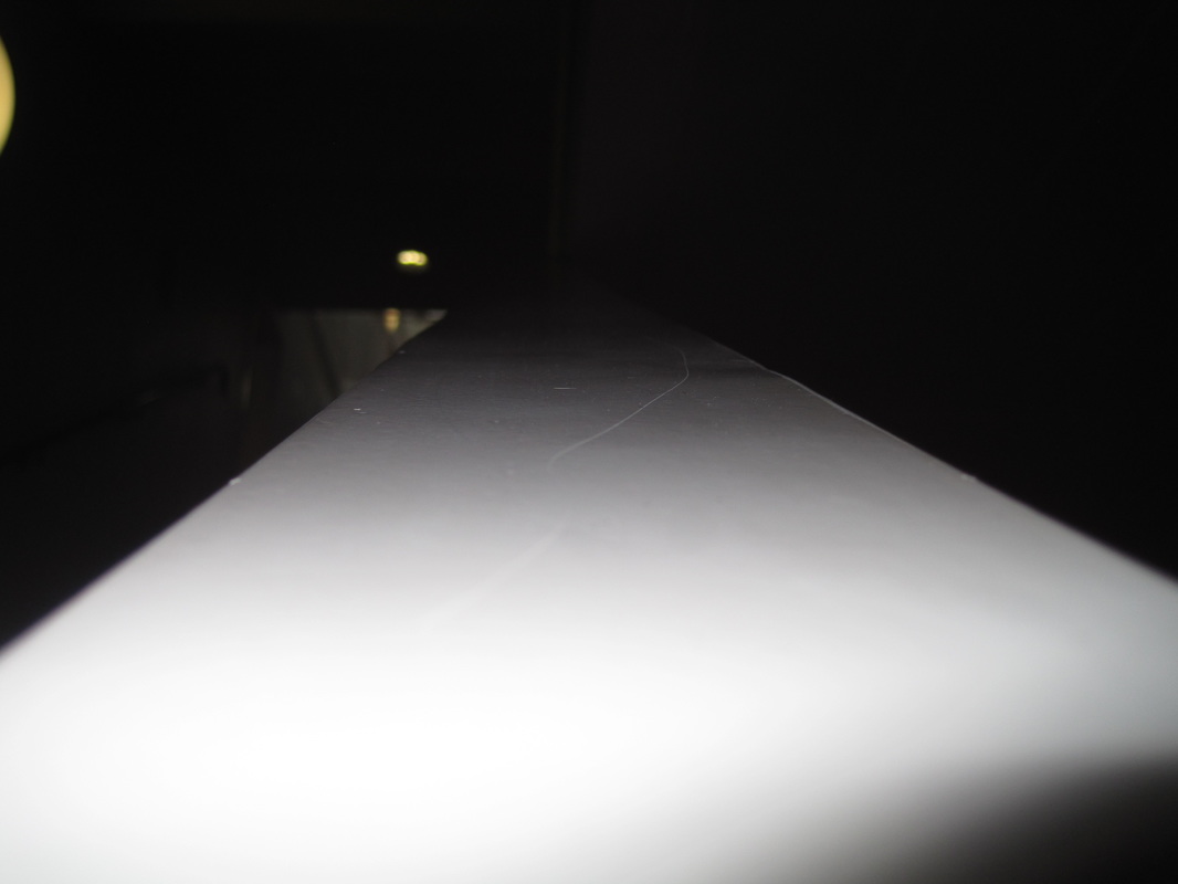
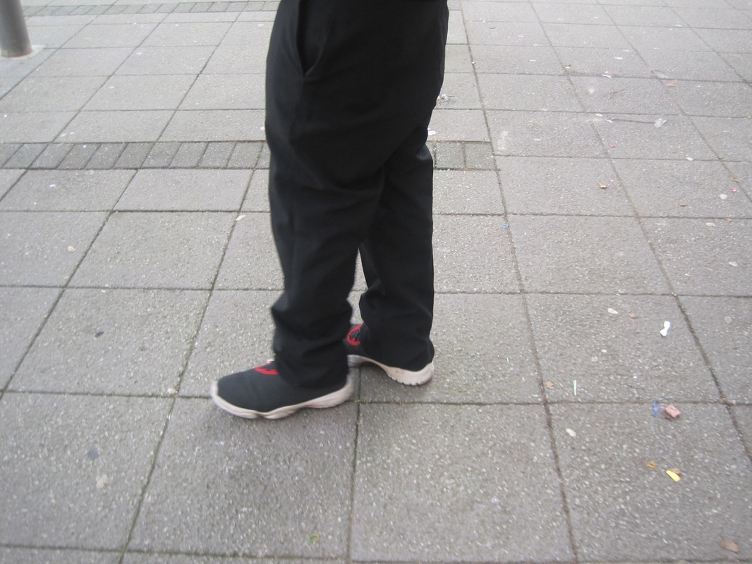
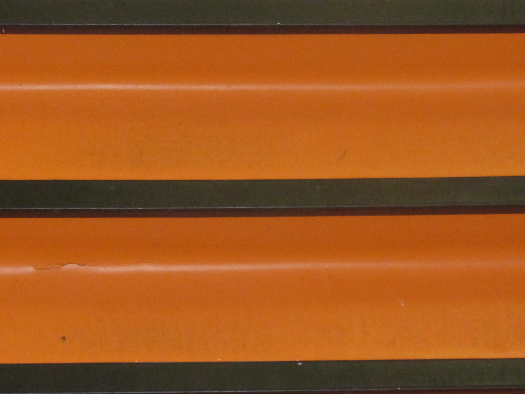
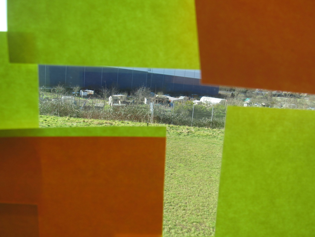
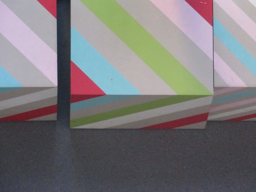
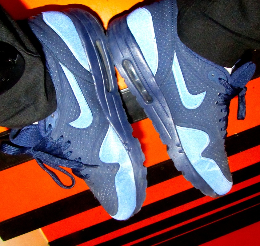
These are abstract photos thats I have taken.
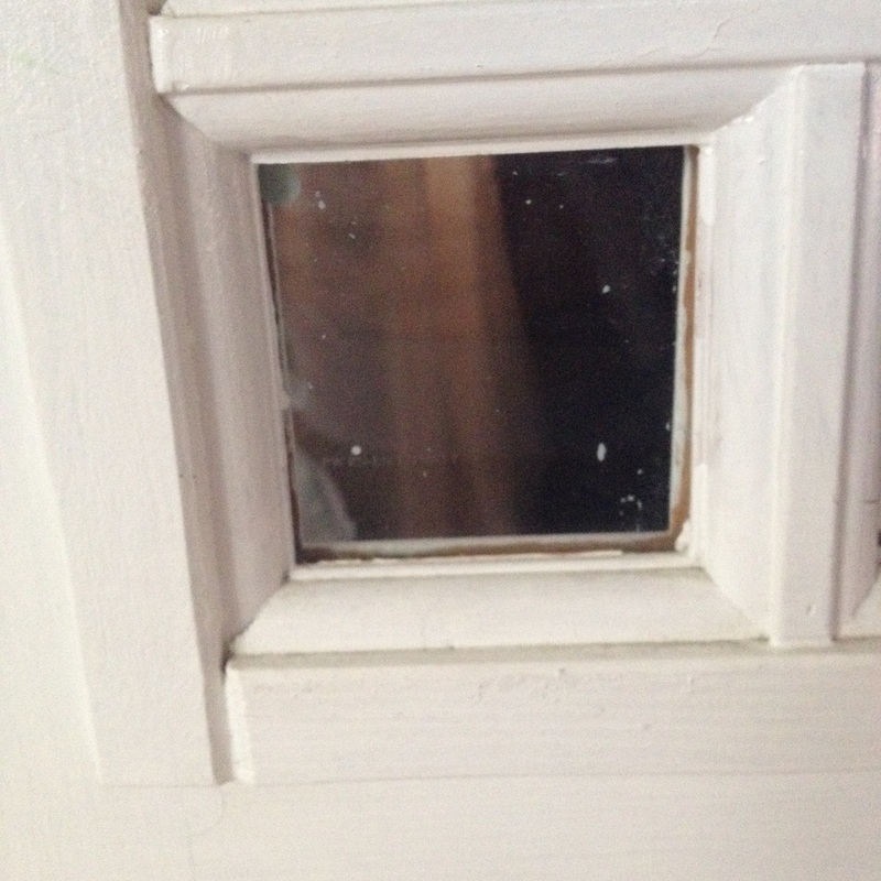
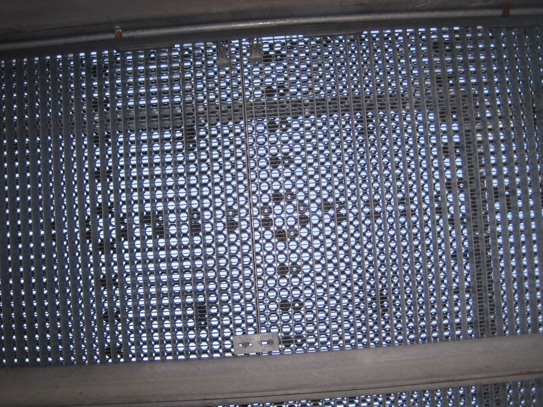
I have taken these photos at home of anything that light reflects good and also dark areas such as picture "5" which is the top part of a radiator.
I have taken these photos at home of anything that light reflects good and also dark areas such as picture "5" which is the top part of a radiator.
Abstraction


|
Focus:
Light: Line: Repetition: Shape: Space: Texture: Value/Tone: |
Which areas appear clearest or sharpest in the photograph? Which do not?
Which areas of the photograph are brightest? Are there any shadows? Does the photograph allow you to guess the time of day? Is the light natural or artificial? Harsh or soft? Reflected or direct? Are there objects in the photograph that act as lines? Are they straight, curvy, thin, thick? Do the lines create direction in the photograph? Do they outline? Do the lines show movement or energy? Are there any objects, shapes or lines which repeat and create a pattern? Do you see geometric (straight edged) or organic (curvy) shapes? Which are they? Is there depth to the photograph or does it seem shallow? What creates this appearance? Are there important negative (empty) spaces in addition to positive (solid) spaces? Is there depth created by spatial illusions i.e. perspective? If you could touch the surface of the photograph how would it feel? How do the objects in the picture look like they would feel? Is there a range of tones from dark to light? Where is the darkest value? Where is the lightest? |
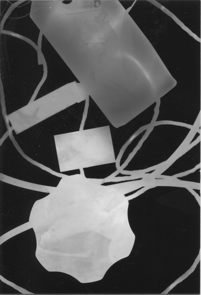
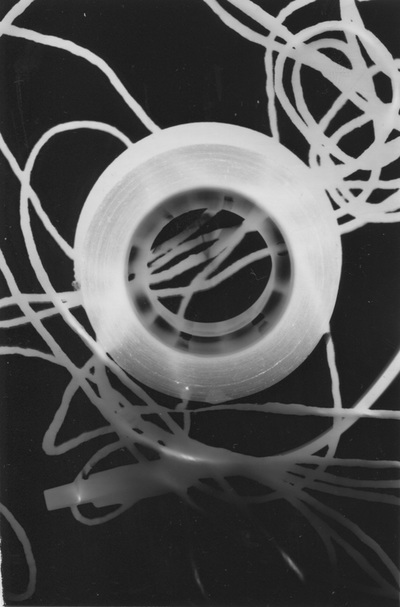
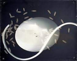
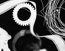
These are the first three photograms I have produced for the abstraction project, my faviroute photogram is the last photogram because it looks 3d and the tone of the tape roll looks like its coming out of the page because of the grey shade and the black insides, Also the white rope near the tape has a glowing effect
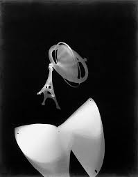

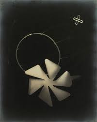
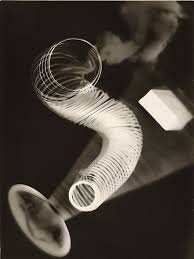
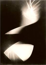
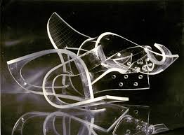
Photogram research
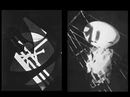
László Moholy-Nagy
Laszlo Moholy-Nagy possessed one of the liveliest and most versatile minds to come out of the revolution in artistic thinking that occurred in Europe after the First World War.
In addition to being a painter, designer, and photographer, Moholy was perhaps the most persuasive and effective theoretician of the concept of art education that grew out of the Bauhaus, the experimental design school that flowered briefly in Germany during the days of the Weimar Republic.
Through his own work, his teaching and writing, and through the influence of his colleagues and followers at the Chicago Institute of Design (which Moholy founded in 1938), his ideas have had a profound effect on the art and art theory of the past generation.
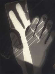
In none of the areas of his concern has his influence been greater than in photography. His deep interest in the photogram and the photomontage, techniques that stood as a halfway house between photography and painting, provided a challenging option to the doctrine of straight photography, which, especially in the United States, dominated serious photography.
Nevertheless, Moholy's own straight photography was extremely interesting and distinctive. It was in fact straight only in the technical sense that the pictures were unmanipulated prints of images recorded by the camera; in terms of the perception that the photographs recorded, they were ambiguous, contrary, and wittily devious.
Moholy's love of the camera was based on the fact that it demonstrated so persuasively that nothing was as it seemed. Judged by academic standards, his photographs were outrageously bad. Inevitably, the normal subject of the picture was half lost in a maze of apparently accidental forms, distorted by unfamiliar perspectives, and framed as though the photographer had not finally decided what his subject really was.
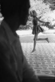
Such a judgment of the picture reproduced here would be natural enough if one thought that it was a photograph of two children, but it is not: It is a photograph of an unfamiliar visual experience, in which space contests with pattern for primacy. The effort to resolve the contradictory claims of the picture plane and the illusion of space has been one of the central preoccupations of twentieth-century art. The photographs of Moholy are a fascinating part of that history.
In addition to being a painter, designer, and photographer, Moholy was perhaps the most persuasive and effective theoretician of the concept of art education that grew out of the Bauhaus, the experimental design school that flowered briefly in Germany during the days of the Weimar Republic.
Through his own work, his teaching and writing, and through the influence of his colleagues and followers at the Chicago Institute of Design (which Moholy founded in 1938), his ideas have had a profound effect on the art and art theory of the past generation.
In none of the areas of his concern has his influence been greater than in photography. His deep interest in the photogram and the photomontage, techniques that stood as a halfway house between photography and painting, provided a challenging option to the doctrine of straight photography, which, especially in the United States, dominated serious photography.
Nevertheless, Moholy's own straight photography was extremely interesting and distinctive. It was in fact straight only in the technical sense that the pictures were unmanipulated prints of images recorded by the camera; in terms of the perception that the photographs recorded, they were ambiguous, contrary, and wittily devious.
Moholy's love of the camera was based on the fact that it demonstrated so persuasively that nothing was as it seemed. Judged by academic standards, his photographs were outrageously bad. Inevitably, the normal subject of the picture was half lost in a maze of apparently accidental forms, distorted by unfamiliar perspectives, and framed as though the photographer had not finally decided what his subject really was.
Such a judgment of the picture reproduced here would be natural enough if one thought that it was a photograph of two children, but it is not: It is a photograph of an unfamiliar visual experience, in which space contests with pattern for primacy. The effort to resolve the contradictory claims of the picture plane and the illusion of space has been one of the central preoccupations of twentieth-century art. The photographs of Moholy are a fascinating part of that history.
Duotone
Research of three of my ideal abstraction photographers.
1. Aaron siskind
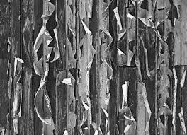
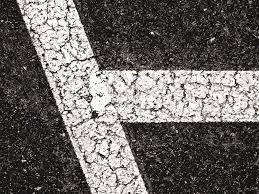
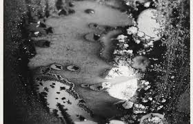
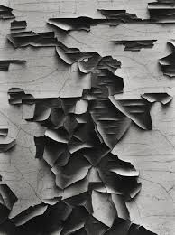
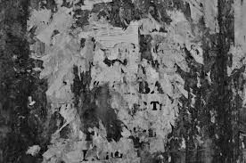
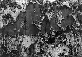
These photos stand out because it looks like its popping out the wall, These are old posters and road marks.
People walk past theses everyday and don't notice how abstract these are.
The third picture in the gallary looks like its a part of a land and the water is the river but its actually concrete and water.
RESEARCH OF AARON SISKIND
Synopsis :Aaron Siskind's early work as a social documentary photographer is best seen in his contributions to the Harlem Document (1932-40), a survey of life in Harlem. Siskind also identified with the ideas and styles of the Abstract Expressionist artists in New York in the 1940s. In these later photographs he continued to emphasize the modernist concern with the flatness of the picture plane, but intensified his approach to picture making - with close-up framing, as well as emphasis on texture, line, and visual rhymes - creating abstract images of the real world.
Key Ideas: Siskind turned the medium of photography on its head, taking pictures of found objects that were simultaneously true-to-life and abstract; he was one of the first photographers to combine what was known as "straight" photography (recording the real world as the lens "sees" it) with abstraction.
Siskind found emotional joy and tension in the process of discovering subjects and photographing them in such a way as to emphasize his reading of the world as essentially abstract, a series of echoing forms, lines, and textures.
Like the Abstract Expressionists, with whom he was friends, Siskind turned away from the social/political world post-World War II, and instead looked inward to seek meaning in the mostly inanimate forms he observed around him.
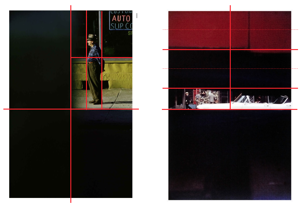
Keld Helmer Petersen Research
Keld Helmer-Petersen’s 122 Farvefotografier (122 Colour Photographs), published in 1948, is a Photobook of great singularity. To gain an idea of just how unusual it was to use color for art photographs at that time, take a look at Martin Parr and Gerry Badger’s richly illustrated The Photobook is a mystery the 2004 study that brought Helmer-Petersen’s landmark to wide attention. Almost everything else is in black-and-white until, in 1976, the Museum of Modern Art published William Eggleston’s Guide, helping to initiate a new era of color photography. Before then, color was routinely used in fashion and advertising, while art-minded photographers still tended to shun it.Since last year it has been possible to experience 122 colourPhotographs in its entirety in Errata Editions’ excellent Books on Books series devoted to making important but hard to see photobooks easily available. These volumes are not reprints or facsimiles, which often sell out and become rare and expensive collectables in their own right. Instead, Errata presents the photobook as a series of reproductions, at reduced size, showing the edge of the binding, along with the original texts, specially commissioned essays and a bibliography. The books are relatively inexpensive and the idea is to keep them in print. Sixteen have appeared so far; earlier volumes include Walker Evans’ American Photographs, William Klein’s Life is Good & Good for You in New York, and Alexey Brodovitch’s Ballet.
Photography controlled assesment
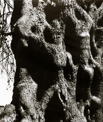
In this photo I can see a tree with a rough texture and holes, In the holes their are shadows which you can tell the pictures was taken in a low angle. Its also very abstractive because it has a lot of of shapes but the most noticeable is the circles and ovals in the picture.
If I had to describe this photograph in words it would be intriguing because this photograph puts a lot of thoughts in my mind such as what it looks like human bodies rambling on top of each other.
If someone that cant see asked me to describe what the photograph looked like to me I would first describe the filter that is used such as black and white, also the tone where theres more shadows or dark areas are, and the texture of the tree like the bumps and rough parts of of the bark.
This photograph is more of an abstraction picture than an naturalistic this is because its only focused on the patterns not the tree itself, such as the shapes.
The things I recognise in this photograph is the tree and also the twigs in the background but what I don't recognise is the shape on the tree, It looks like people climbing on top of each other.
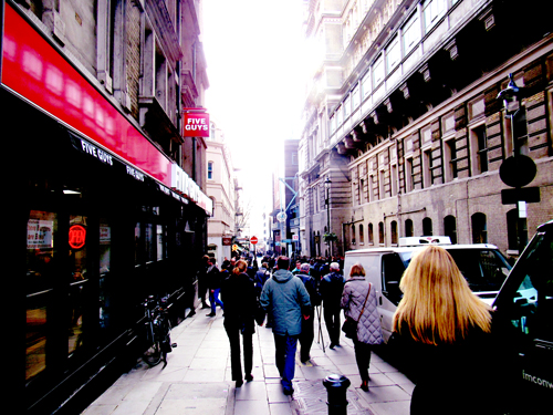
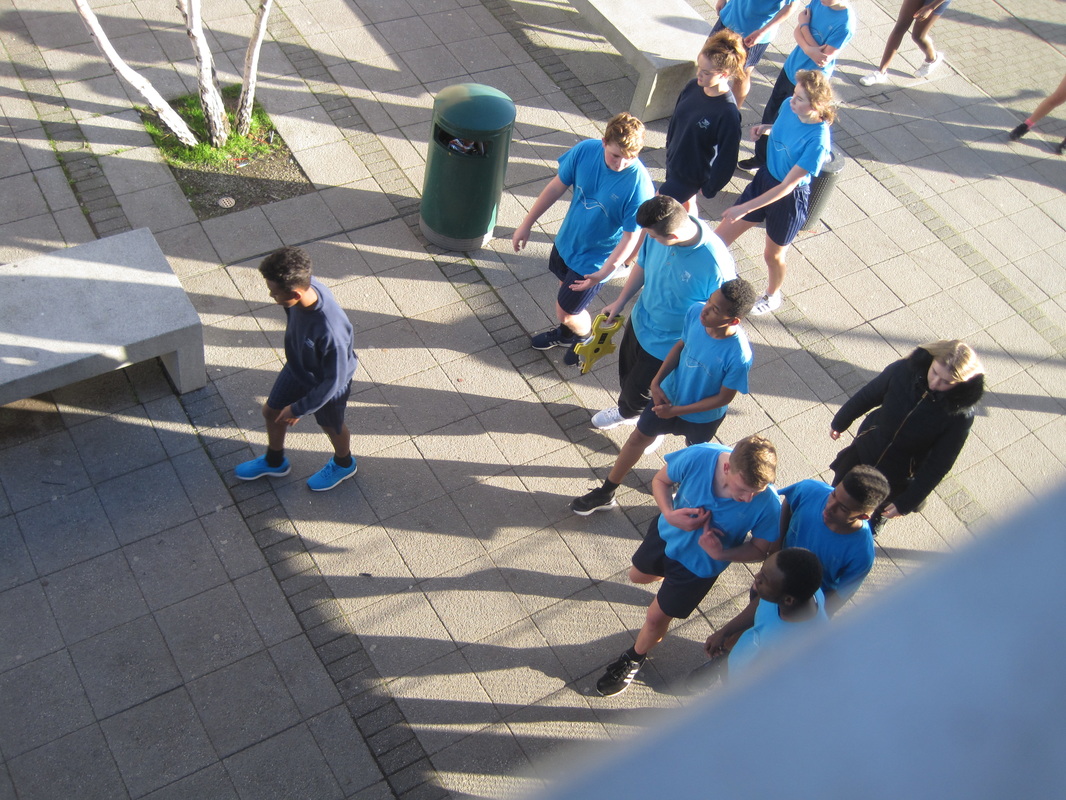
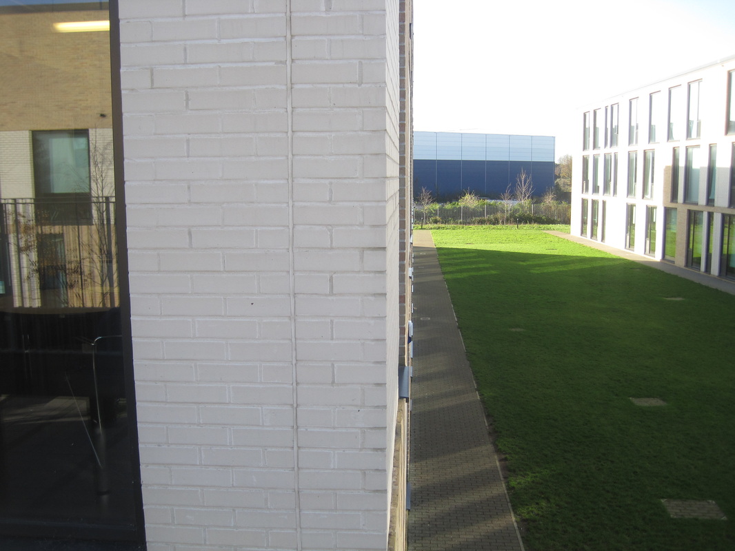
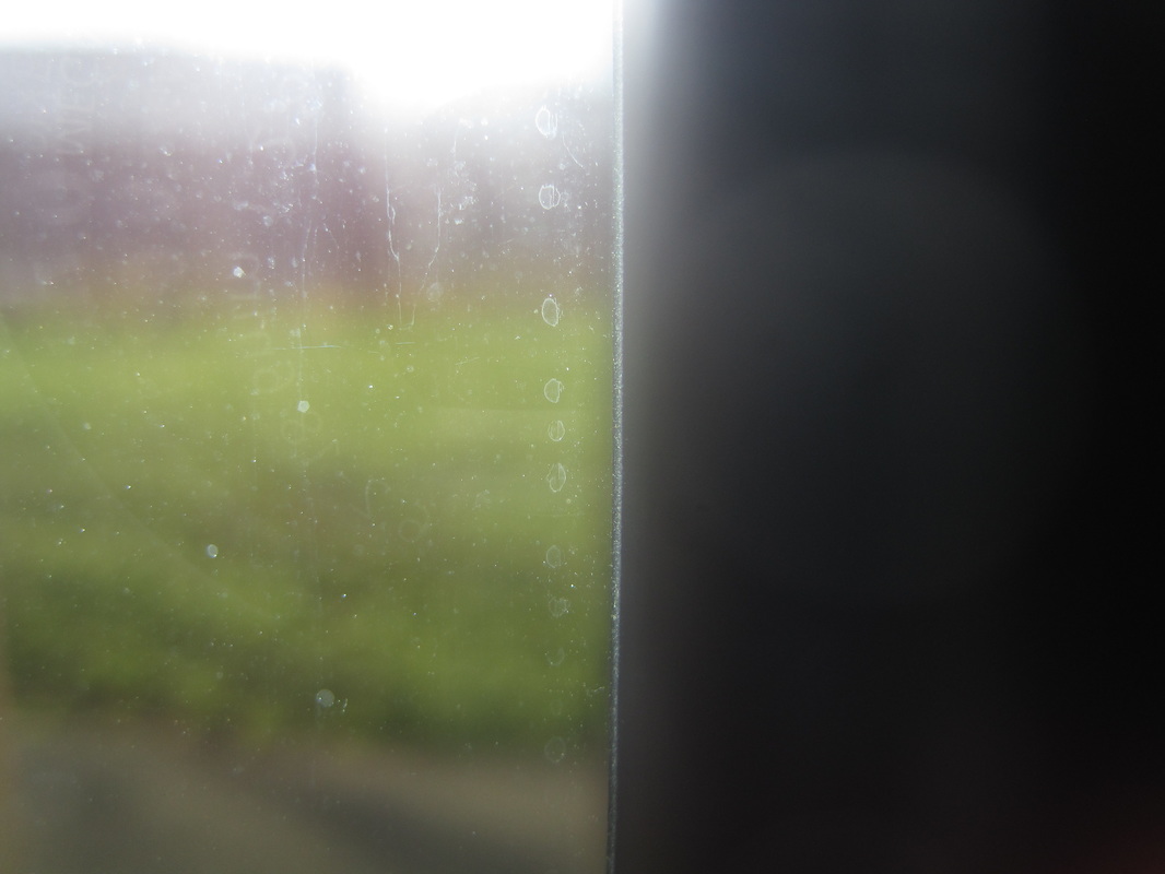
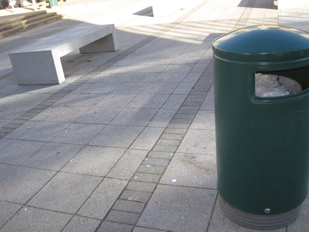
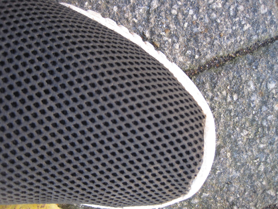
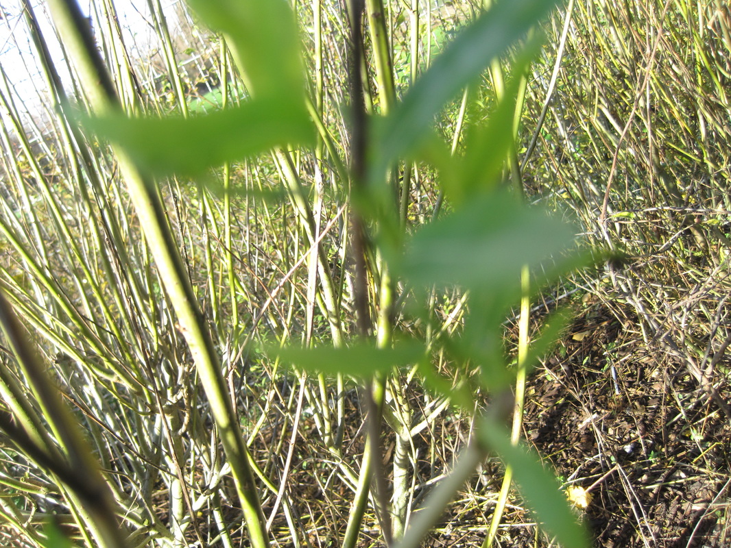
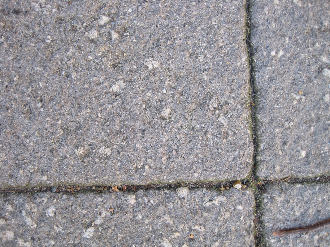
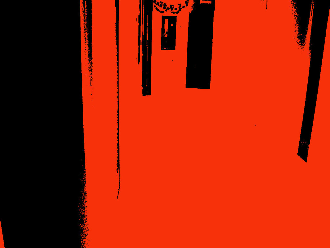
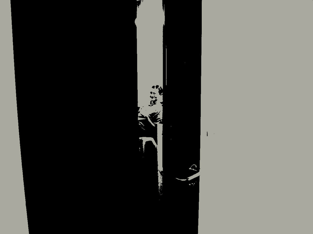
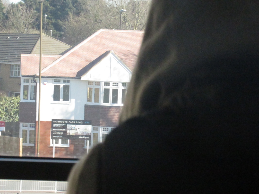
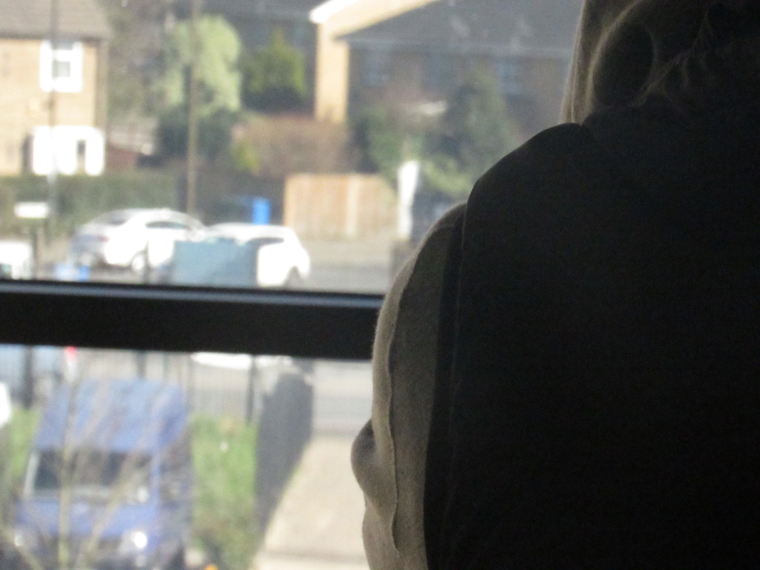
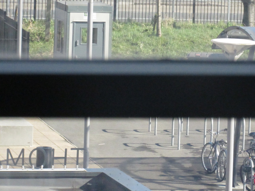
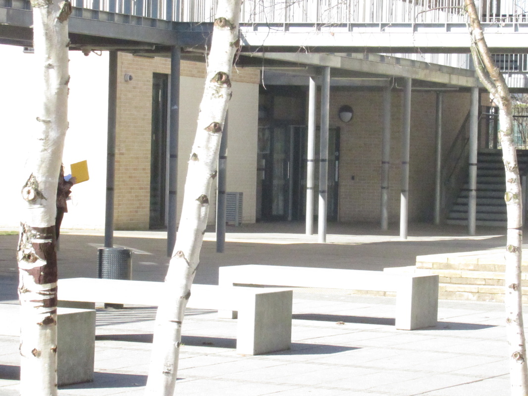
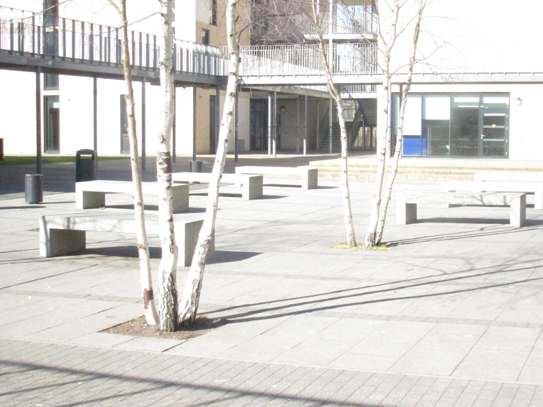
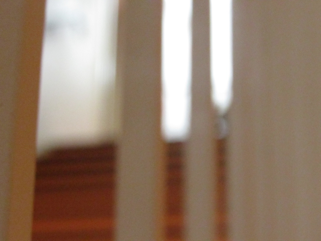
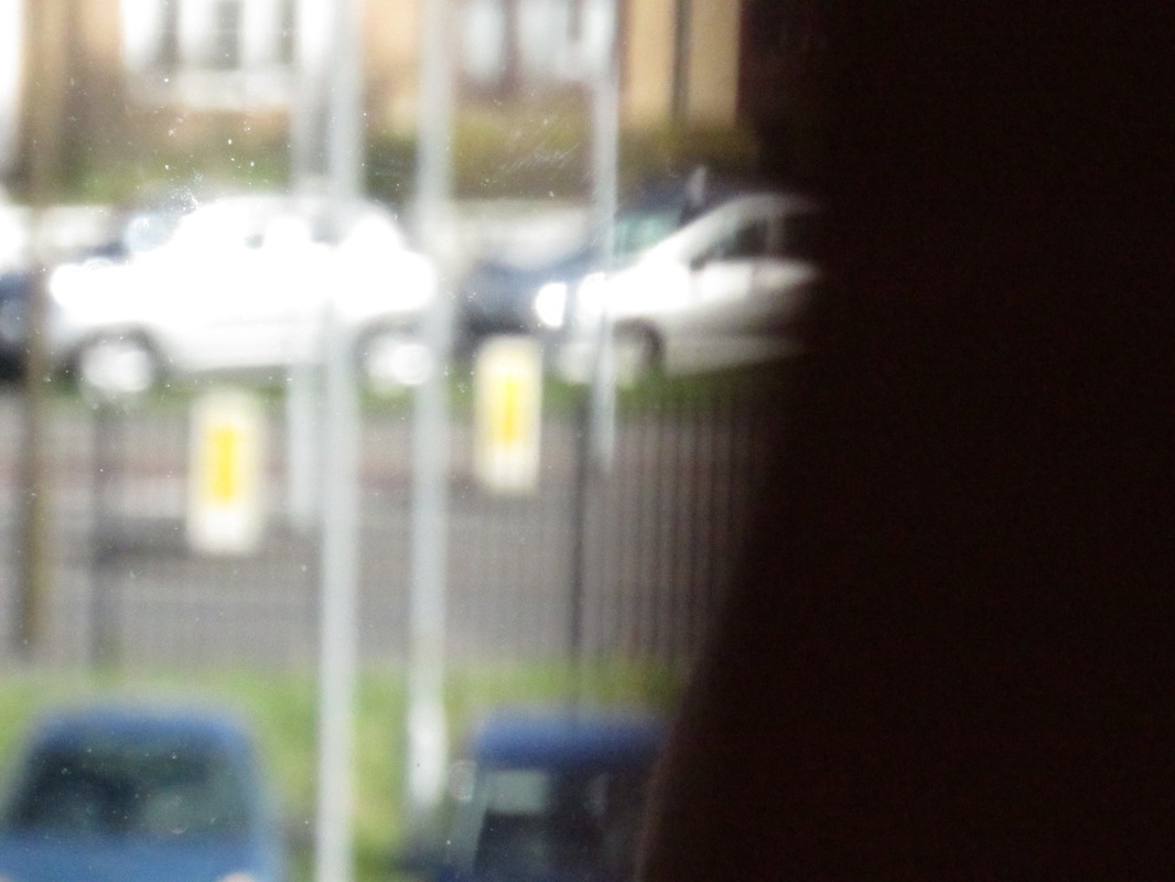
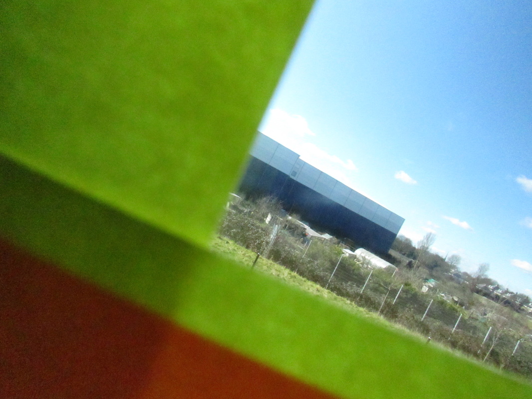
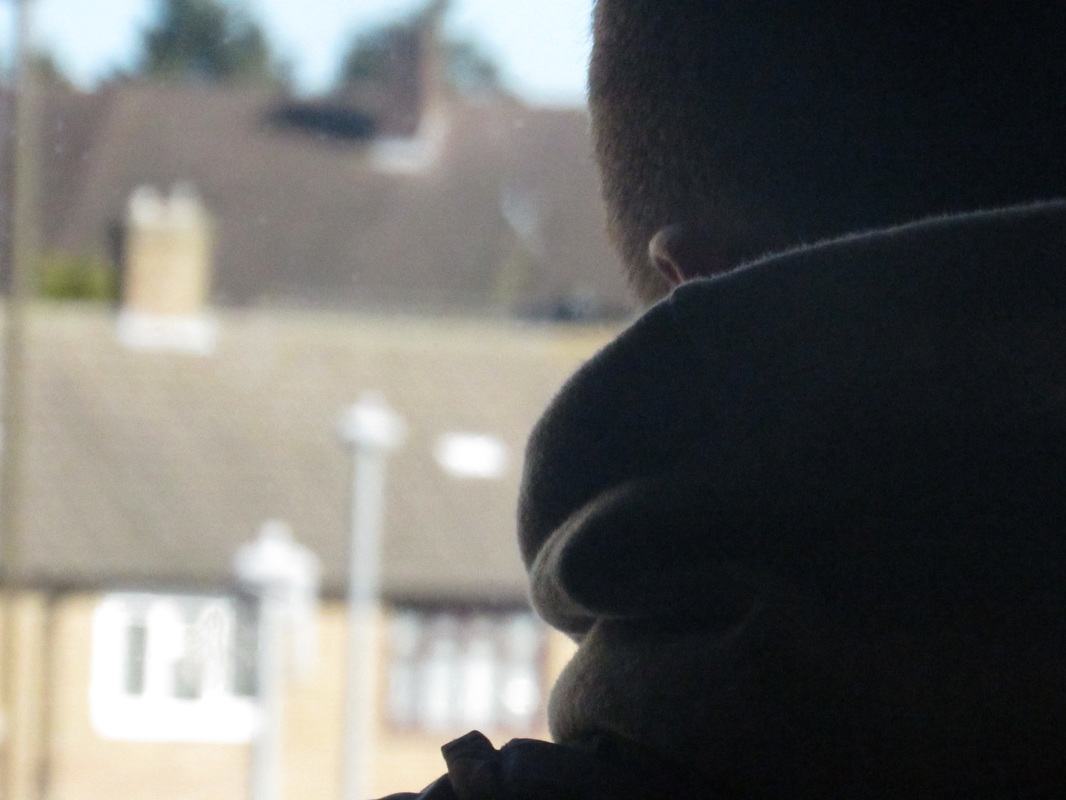
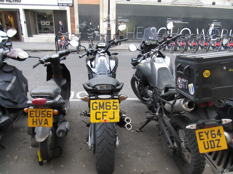
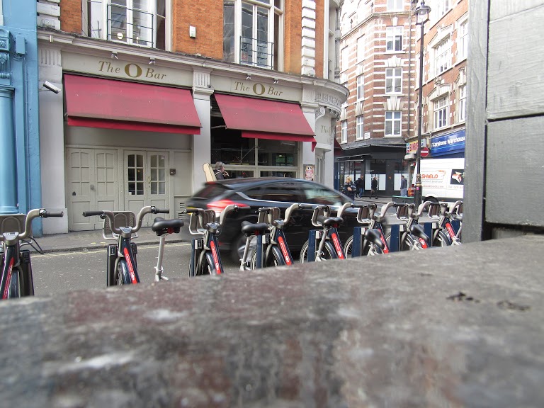
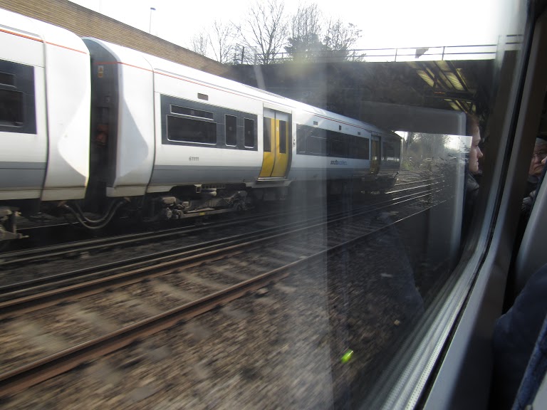
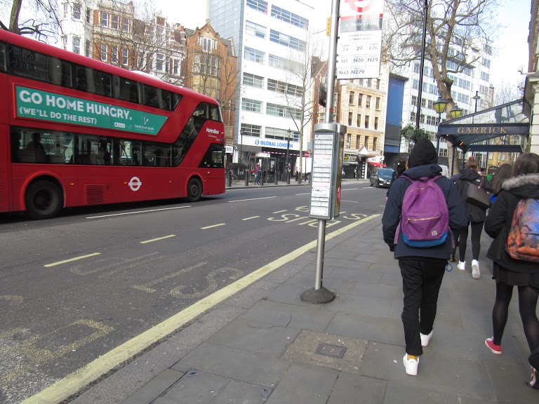
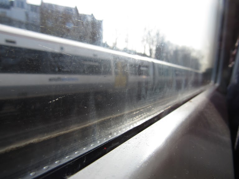
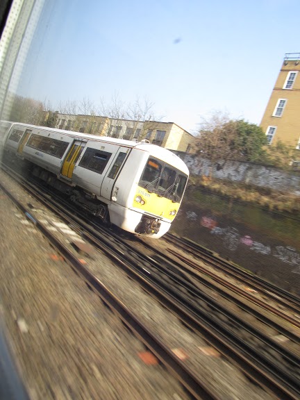
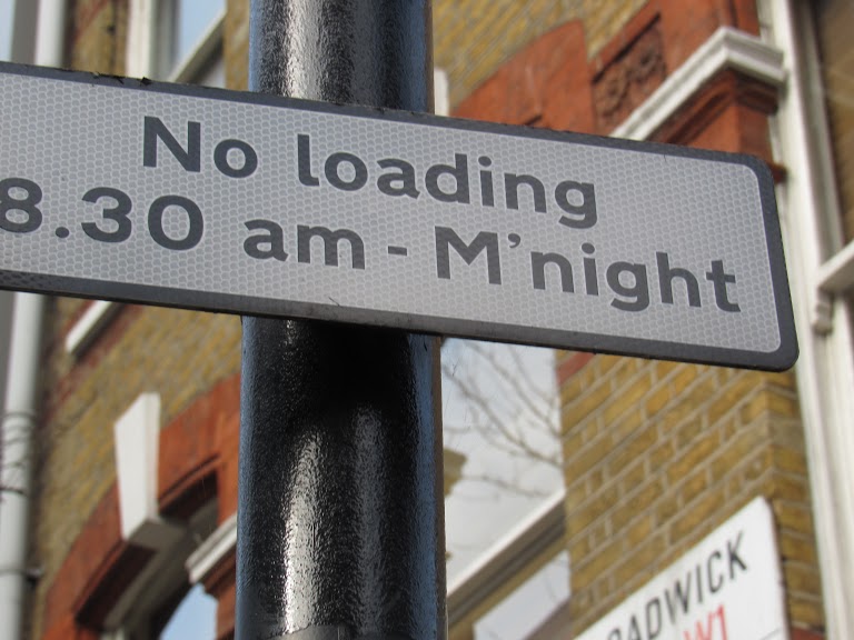
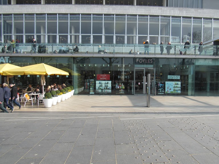
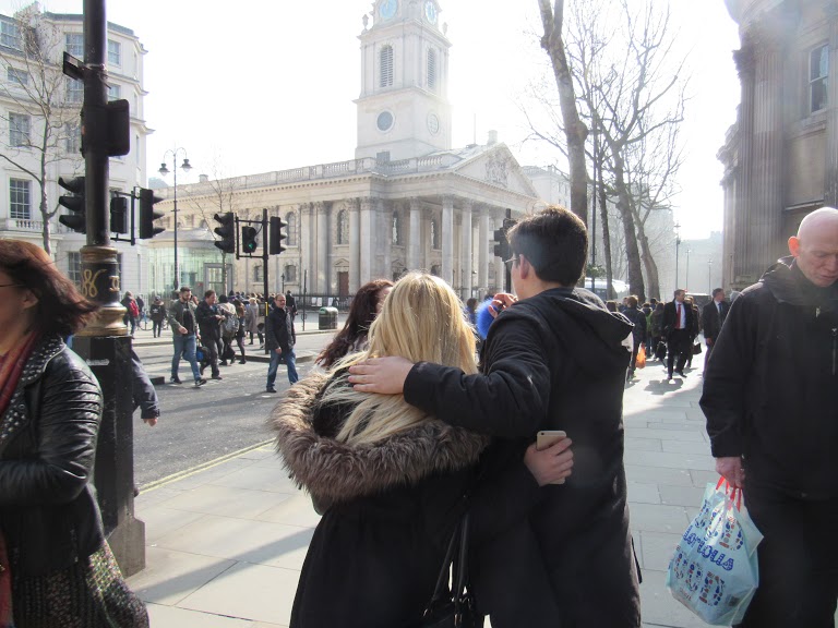
The following photographs are taken around the school, with an DSLR camera. Some are taken inside the school blocks and the rest are taken through glass windows.


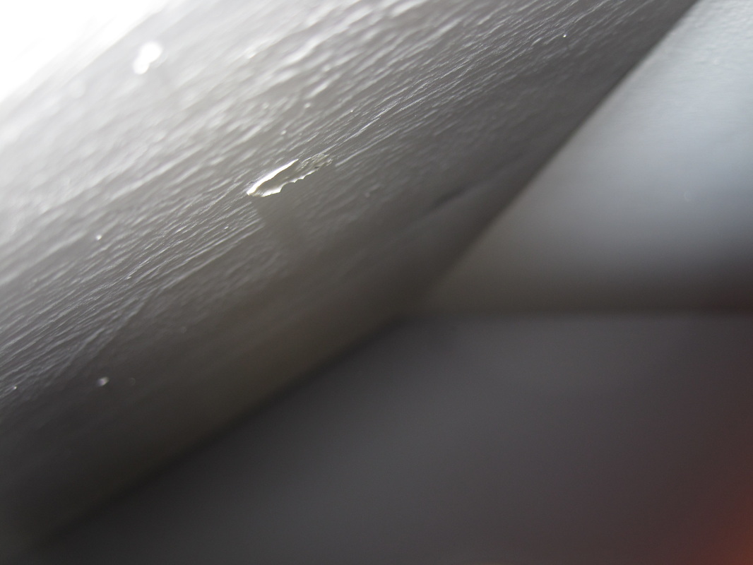
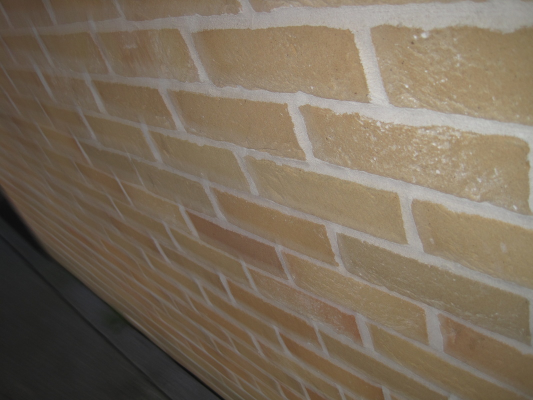


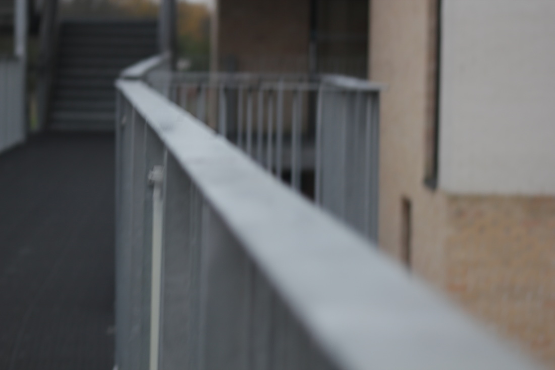
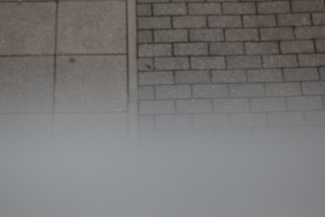
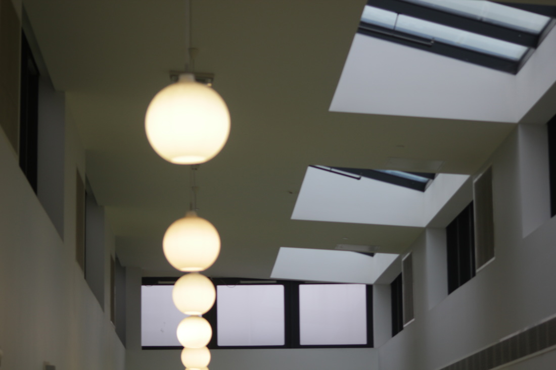
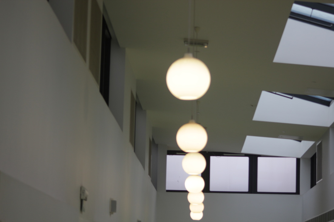
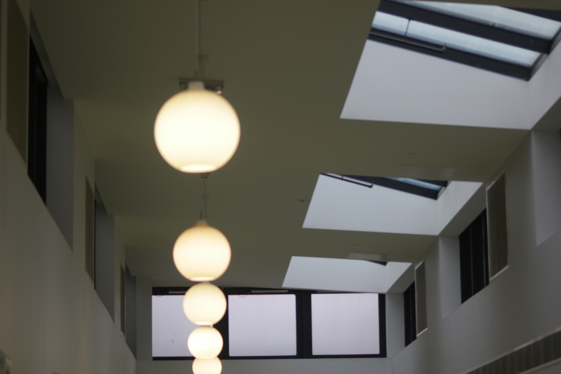
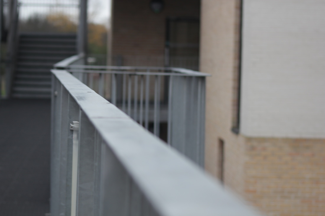
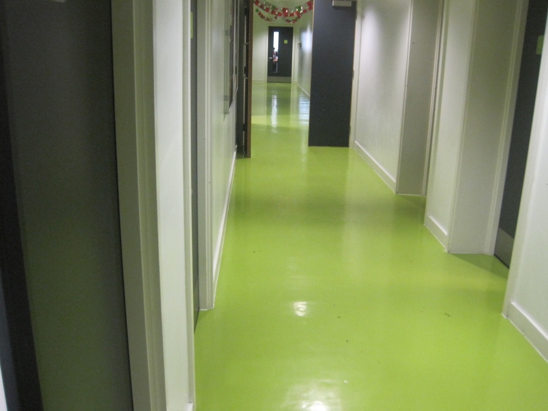
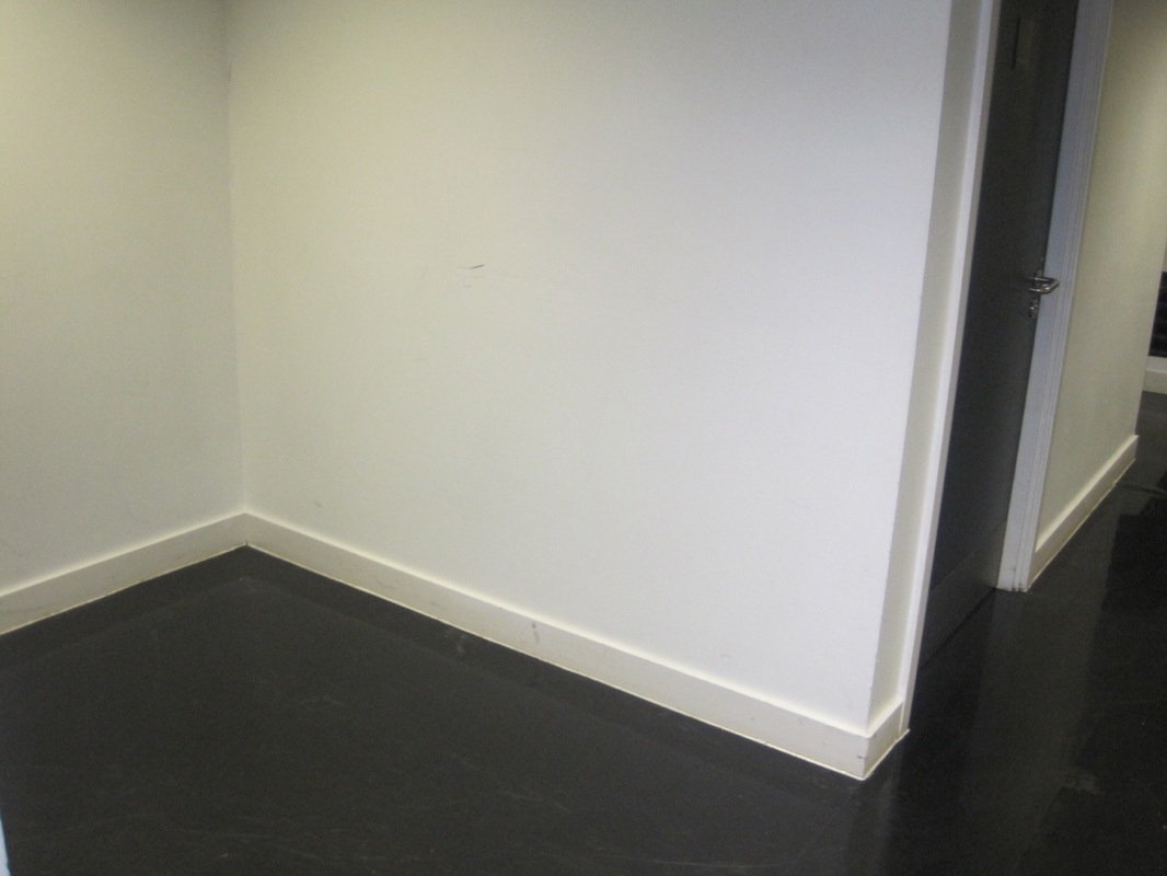

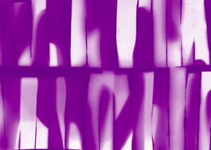
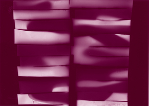
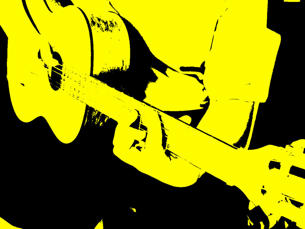
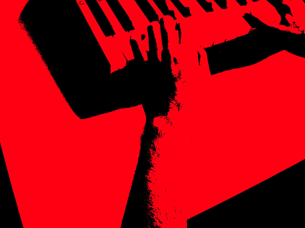
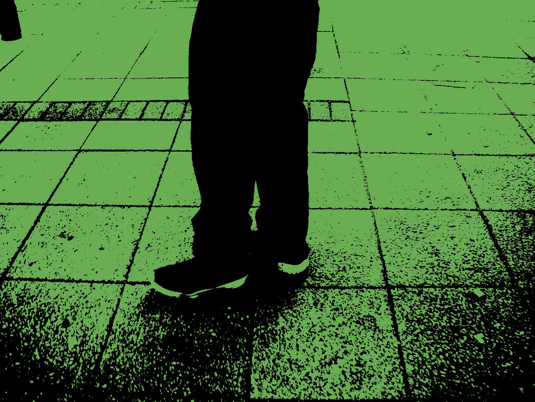
Theses are duo tone black and white.
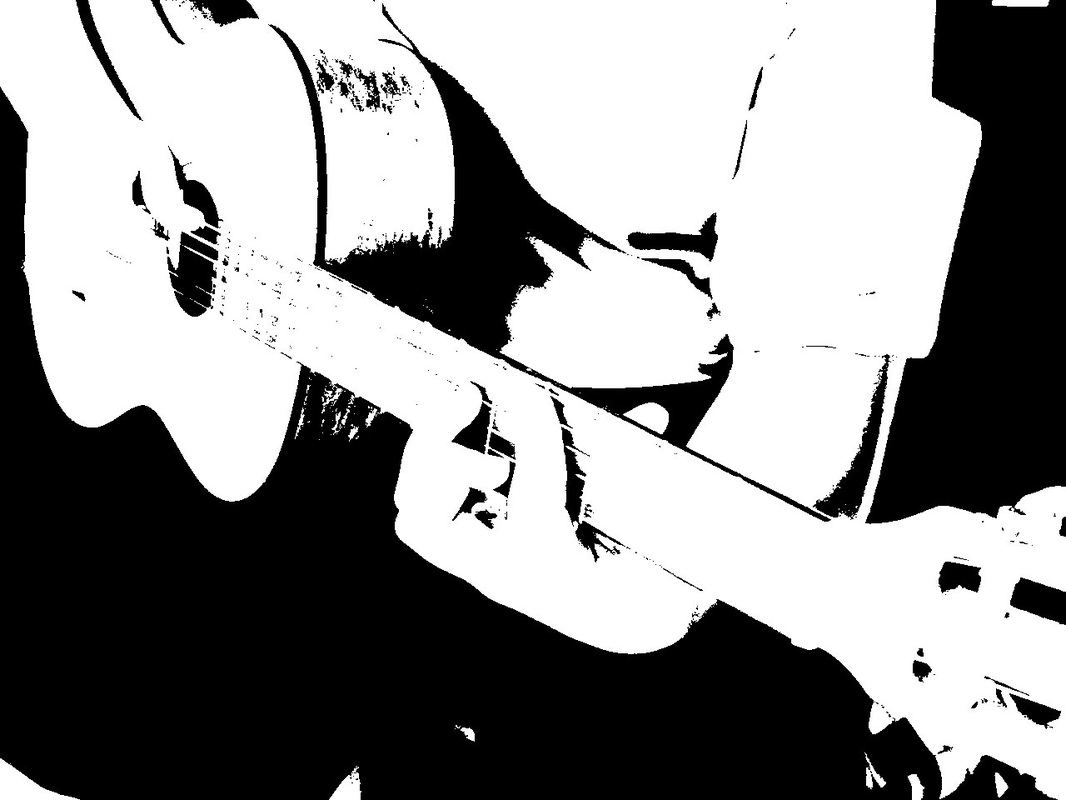
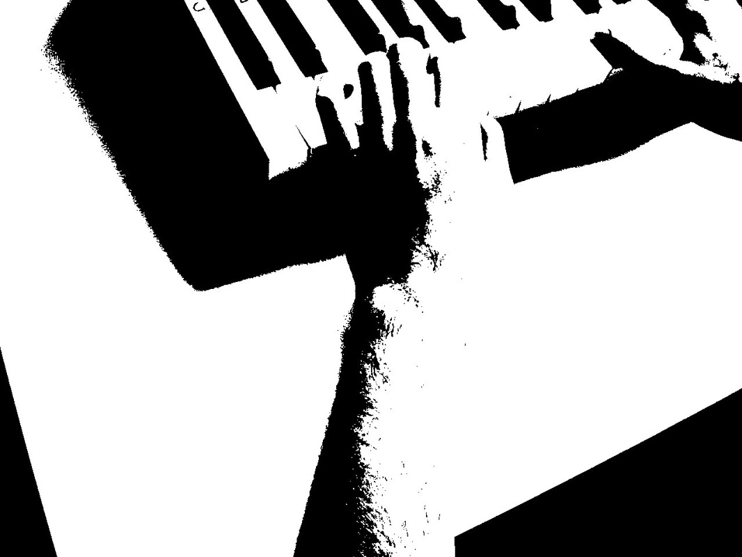
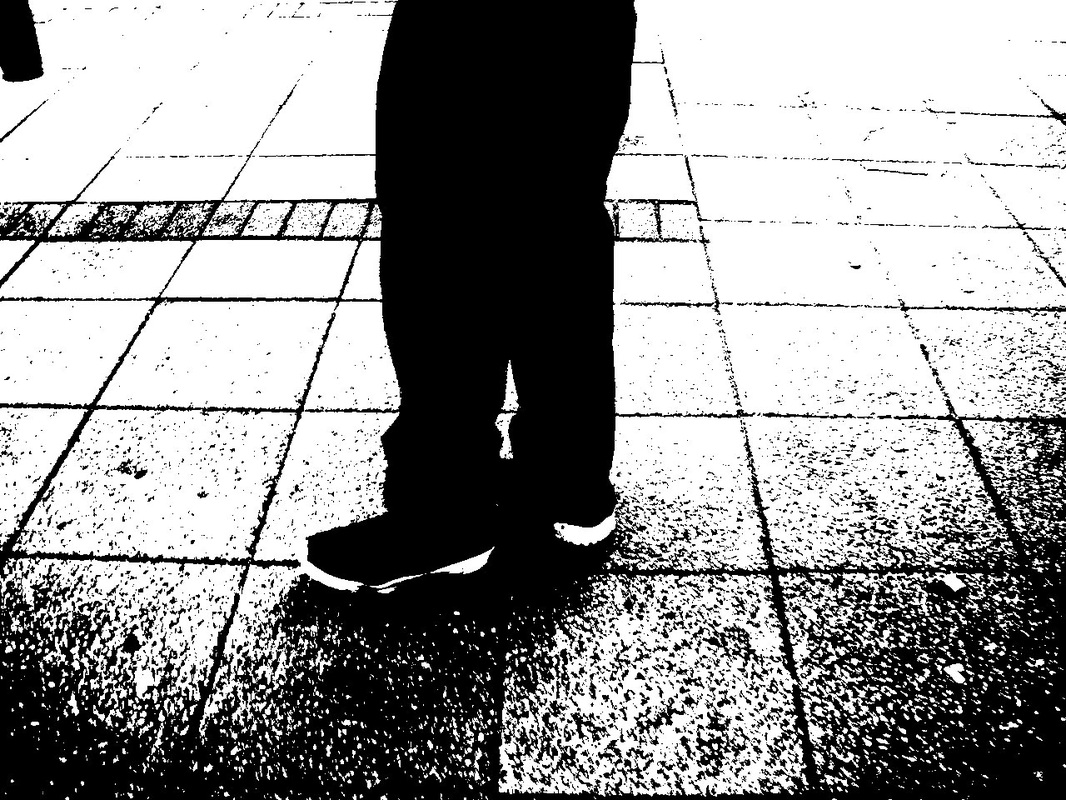

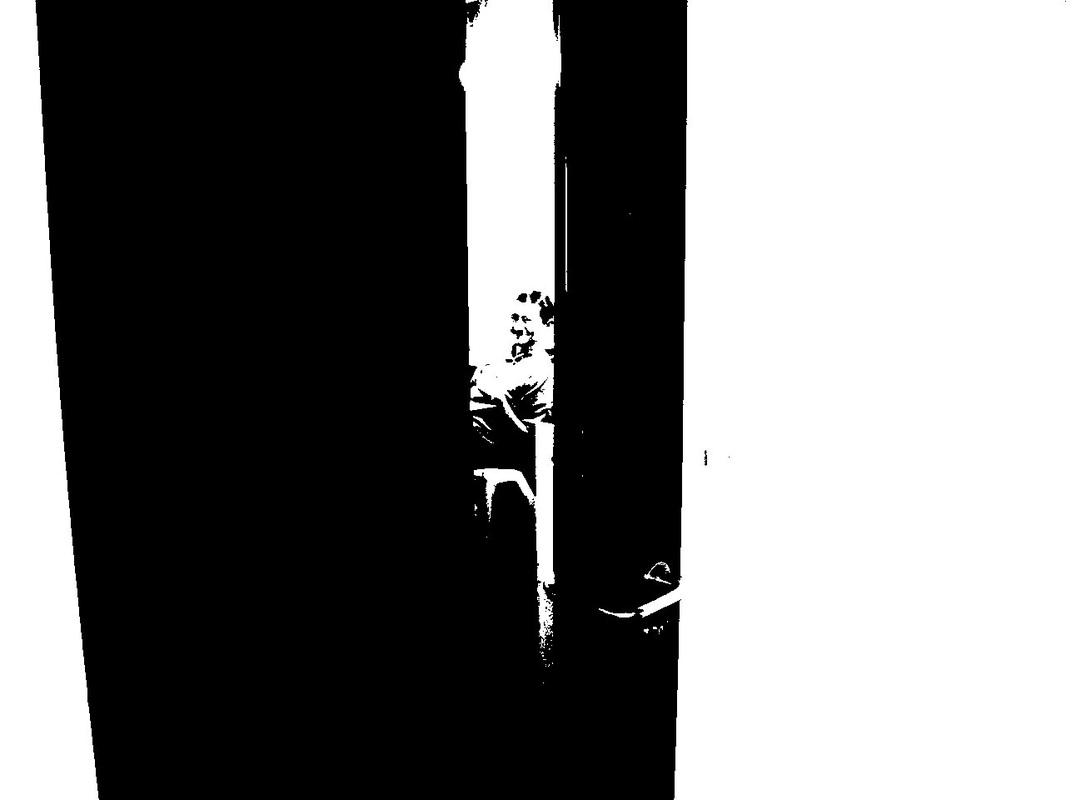
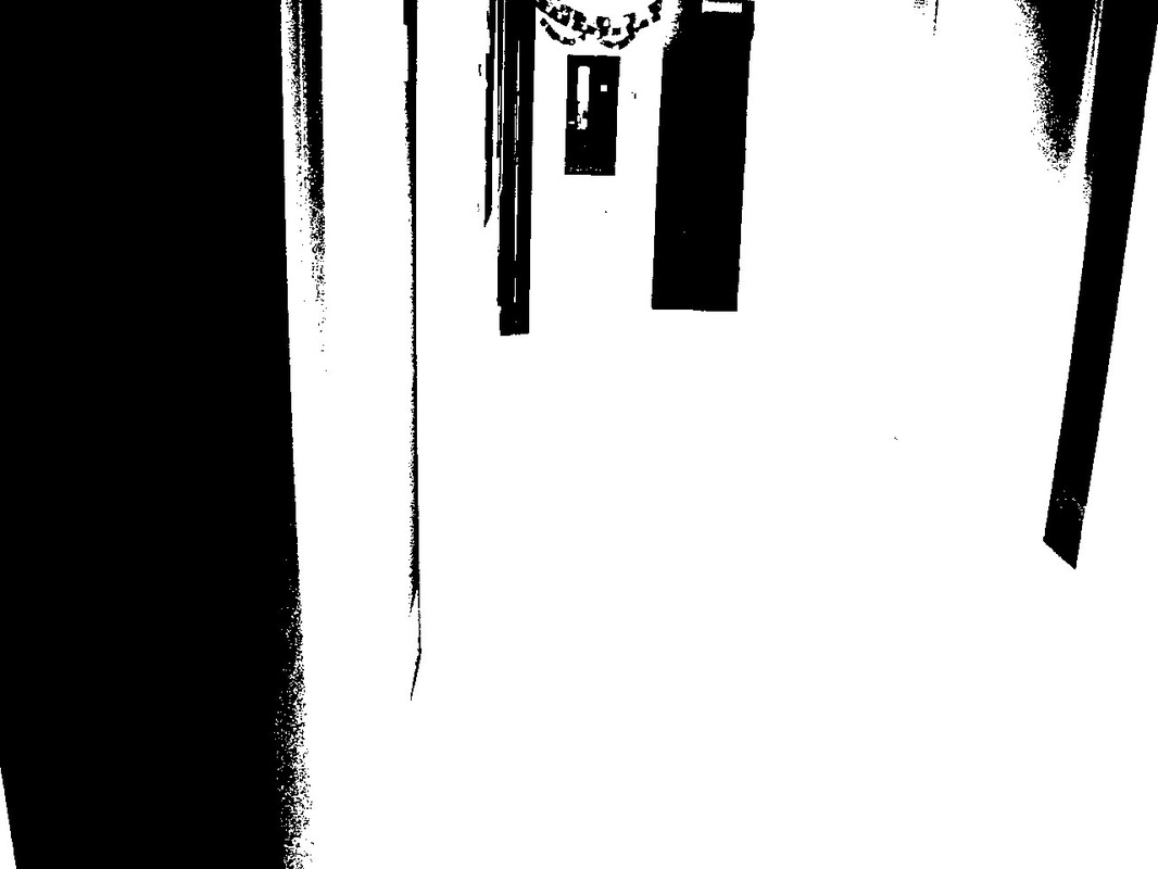
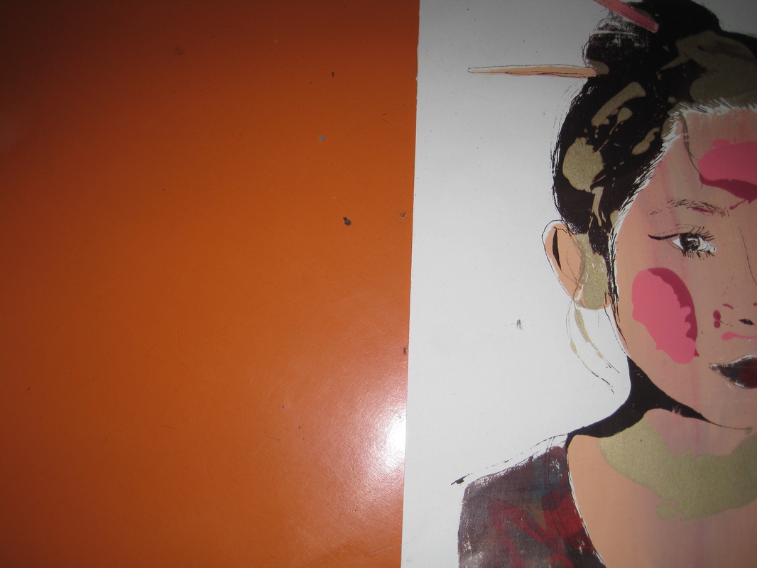
These are duo tones with colours instead of black and white.

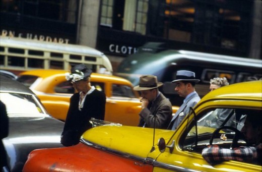
Saul Leiter research.
thSaul Leiter (līt´ər), 1923–2013, American photographer, b. Pittsburgh. A painter in the early 1940s, Leiter switched to photography late in the decade. Along with Robert Frank and Diane Arbus, he is considered a member of the 1940s and 50s New York school, but he experimented with color photography instead of concentrating on stark black-and-white. He specialized in New York City street photographs that are sensitive, often painterly and abstract, and intensely personal. Although he was among the finest art photographers of his era and has been called one of the most important early color photographers, his work was little known until the 21st cent.; many of his images have been exhibited only rarely or remain unprinted.
Saul Leiter started shooting color and black-and-white street photography in New York in the 1940s. He had no formal training in photography, but the genius of his early work was quickly acknowledged by Edward Steichen, who included Leiter in two important MoMA shows in the 1950s. MoMA’s 1957 conference “Experimental Photography in Color” featured 20 color photographs by Leiter.
After that, however, Leiter's personal color photography was, for the most part, not shared with the public. He became better-known as a successful fashion photographer in the 1950s and 60s. All the while, Leiter continued to stroll the streets wherever he was (mostly New York and Paris), making photographs for his own pleasure. He printed some of his black-and-white street photos, but kept most of his color slides tucked away in boxes. It was only in the 1990s that he began to look back at that remarkable color work and start to make prints. His sense of color and densely compressed urban life represents a truly unique vision of those times.
The first European retrospective of Saul Leiter's street photography is taking place right now at the Fondation Henri Cartier-Bresson in Paris. The exhibition includes one floor of black-and-white images, and another floor of all color. The color work is especially thrilling to see because not much of it had been seen before — and it is all wonderful and quirky and surprisingly fresh. A book just published by Steidl coincides with this retrospective, and includes more than 100 black-and-white and color photographs.
This was taken from the webiste: https://www.lensculture.com/articles/saul-leiter-saul-leiter-1950-60s-color-and-black-and-white
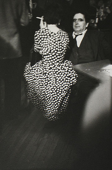
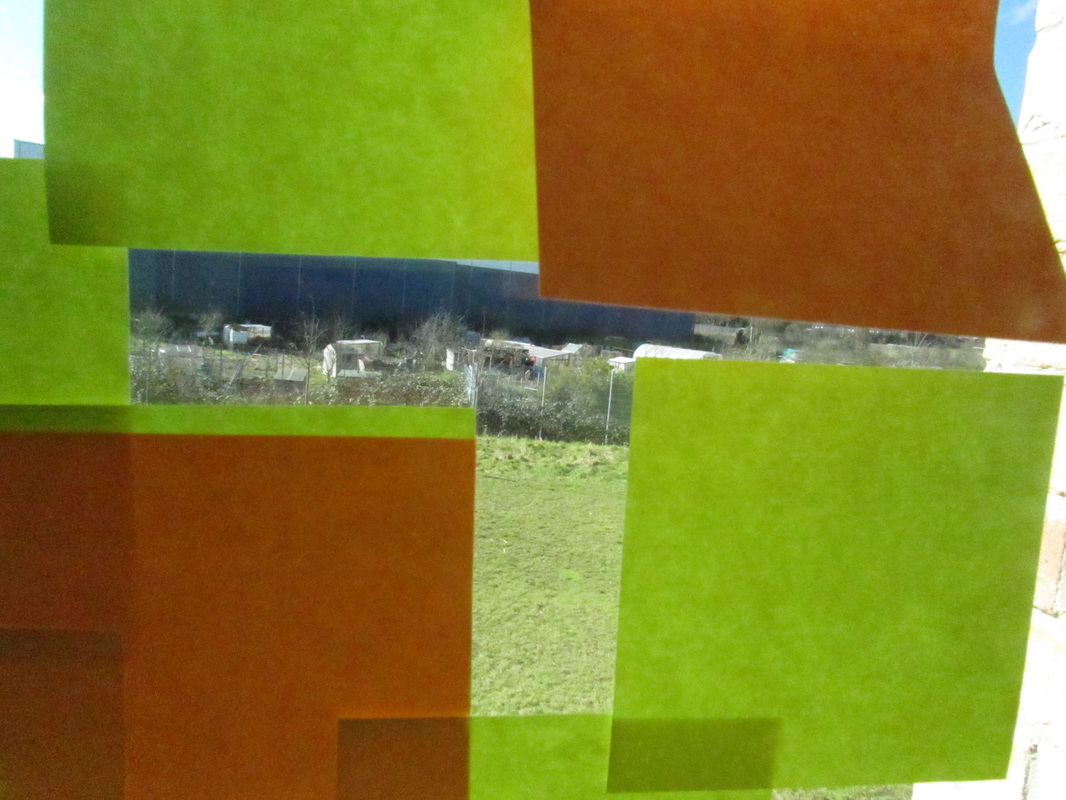
Saul leiters pictures.
SAUL LEITER INSPIRED PAINTING.
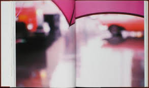
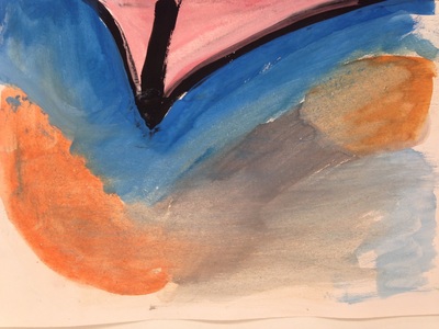
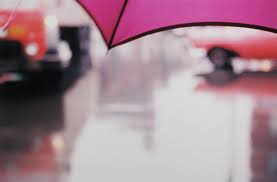
In the original photograph the umbrella is the subject matter and everything all in the background is out of focus,
Also there is bright coloured cars in the background so they stand out. On the right side is a painting i have done myself in my photography lesson, I have tried to use all the colors i can see in the original and try make it more like the original.
Also there is bright coloured cars in the background so they stand out. On the right side is a painting i have done myself in my photography lesson, I have tried to use all the colors i can see in the original and try make it more like the original.
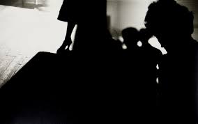
Saul Lieter gallery
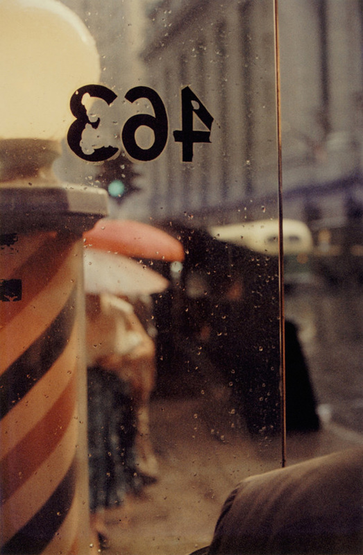
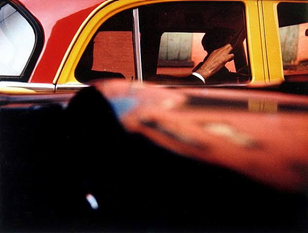
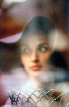
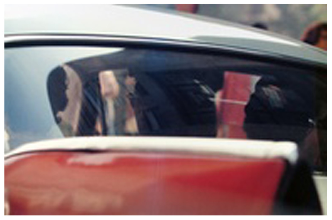
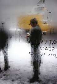
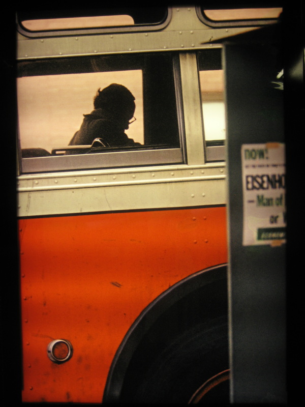
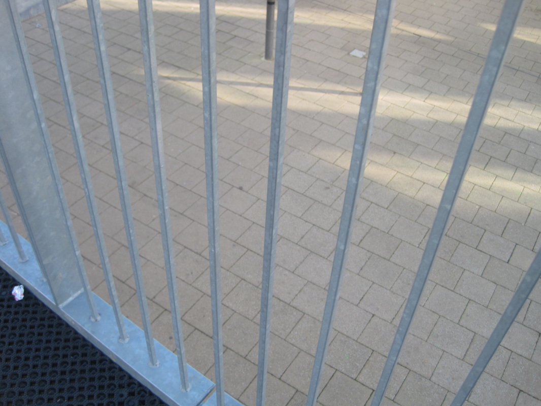
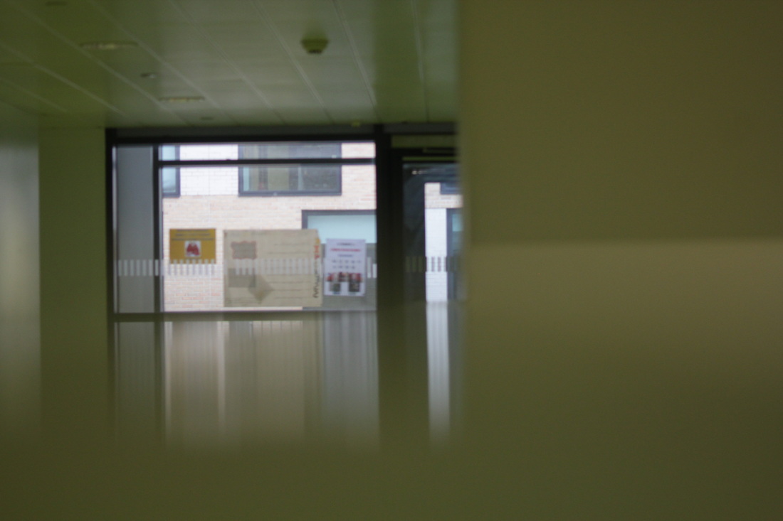
* He takes a lot of pictures through glass.
* Most of his photos, one thing blurs out most of the picture.
* In some of his photos, there is t least one person in it.
* All of his photos are abstract.
* When he takes photos through glass, most of the glass is wet or blurry.
* Most of his photos, one thing blurs out most of the picture.
* In some of his photos, there is t least one person in it.
* All of his photos are abstract.
* When he takes photos through glass, most of the glass is wet or blurry.
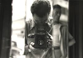
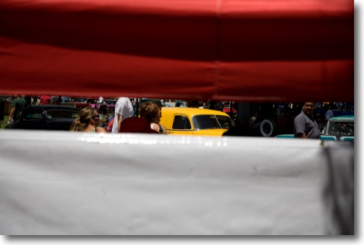
My attempt of saul lieter
Saul lieter biography.
Saul Leiter’s ground-breaking work in photography and painting is only now receiving the international recognition it deserves. Born in Pittsburgh in 1923, Saul Leiter was the son of a distinguished Talmudic rabbi. Leiter’s interest in art began in his late teens, and in 1946, when he was 23, he left Cleveland and moved to New York City to pursue painting. That year he met the Abstract Expressionist painter Richard Pousette-Dart, who was also experimenting with photography. Leiter’s friendship with Pousette-Dart, and soon after with W. Eugene Smith, and the photography exhibitions he saw in New York, particularly that of Henri Cartier-Bresson at the Museum of Modern Art in 1947, inspired his growing interest in photography.
Leiter’s earliest black and white photographs show an extraordinary affinity for the medium, and by 1948 he began to experiment in color. Edward Steichen included Leiter’s black and white photographs in the exhibition Always the Young Stranger at the Museum of Modern Art in 1953. In the late 1950s the art director Henry Wolf published Leiter’s color fashion work in Esquire and later in Harper’s Bazaar. Leiter continued to work as a fashion photographer for the next 20 years and was published in Show, Elle, British Vogue, Queen, and Nova.
Leiter has made an enormous and unique contribution to street photography. His abstracted forms and radically innovative compositions have a painterly quality that stands out among the work of his New York School contemporaries. Perhaps this is because Leiter has continued through the years to work as both a photographer and painter. His painterly sensibility reaches its fruition in his painted photographs of nudes on which he has actually applied layers of gouache, casein and watercolor in a whimsical and sensuous way. His masterful use of the two media is apparent in these remarkable pieces.
Martin Harrison, editor and author of Saul Leiter Early Color, writes, “Leiter’s sensibility…placed him outside the visceral confrontations with urban anxiety associated with photographers such as Robert Frank or William Klein. Instead, for him the camera provided an alternate way of seeing, of framing events and interpreting reality. He sought out moments of quiet humanity in the Manhattan maelstrom, forging a unique urban pastoral from the most unlikely of circumstances.”
Saul Leiter’s work is featured prominently in Jane Livingston’s The New York School and in Martin Harrison’s Appearances: Fashion Photography Since 1945. His work is in the collections of the Museum of Fine Arts, Houston; the Art Institute of Chicago; the Baltimore Museum of Art; the Victoria and Albert Museum; the National Gallery of Australia; the Whitney Museum of American Art; the Milwaukee Art Museum; the Yale University Art Gallery; and other prestigious public and private collections.
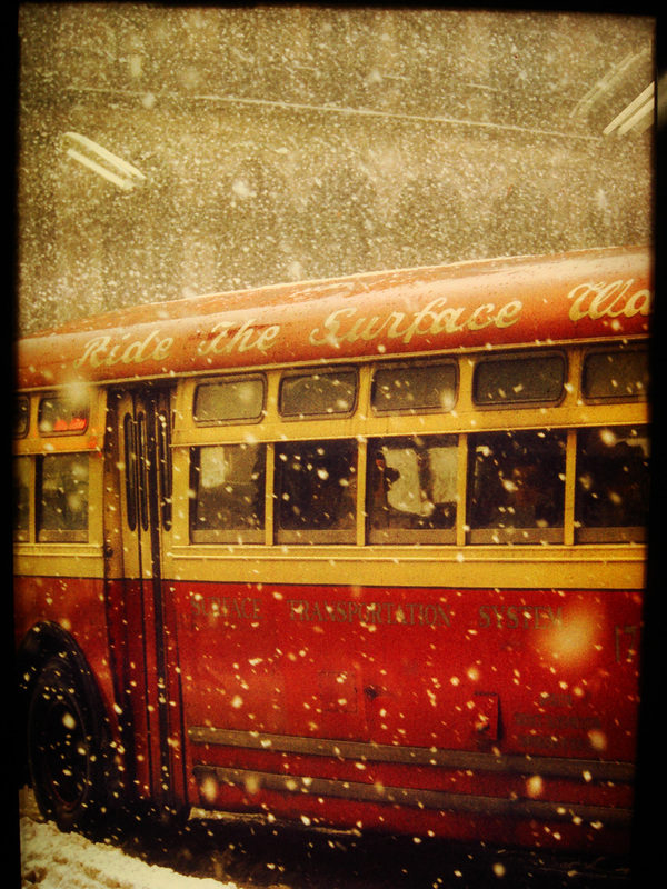
More pictures inspired by Saul leiter
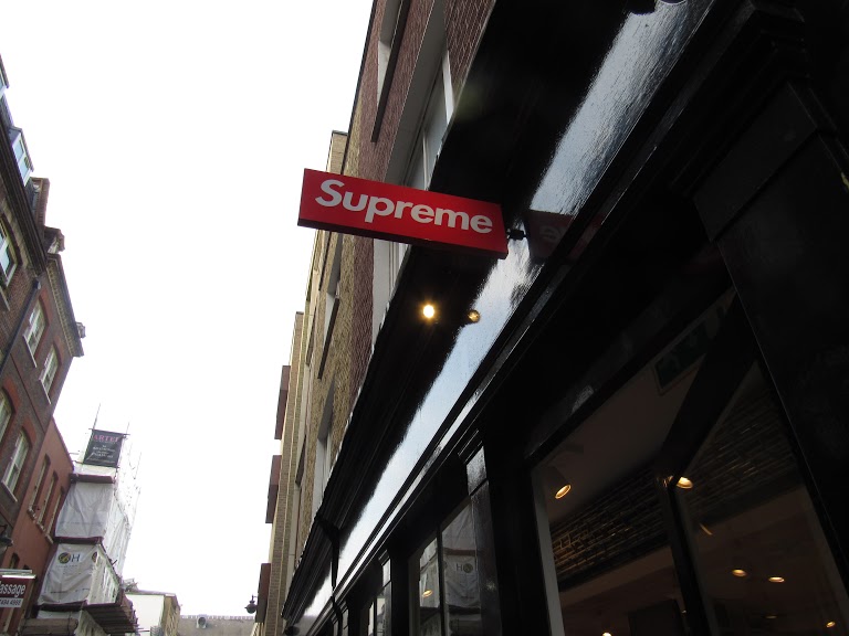
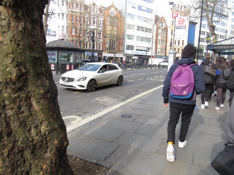
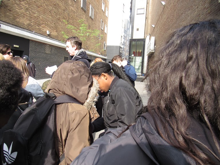
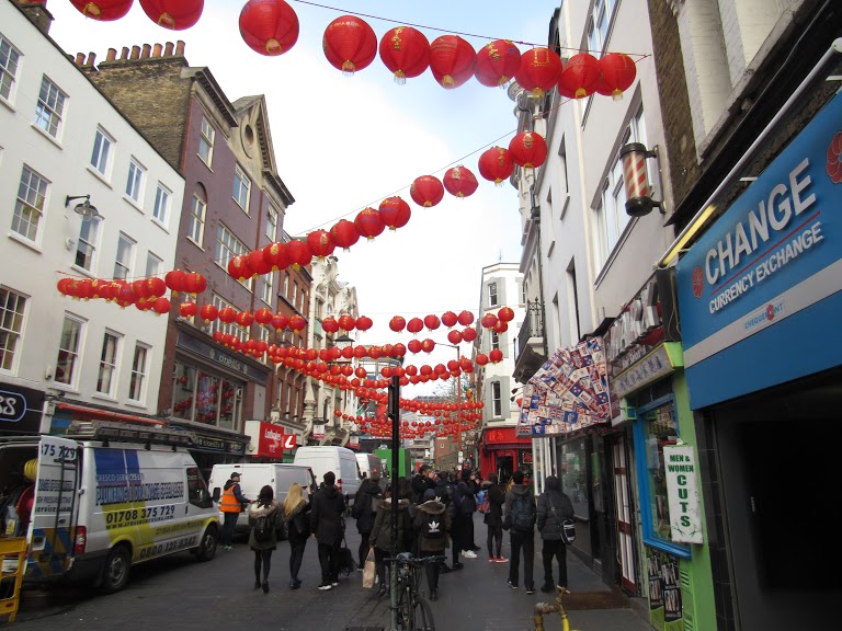
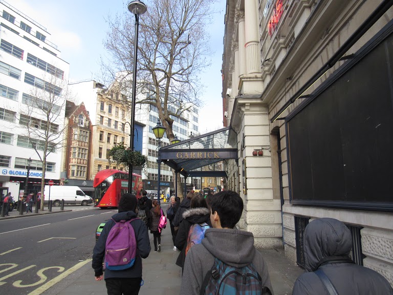
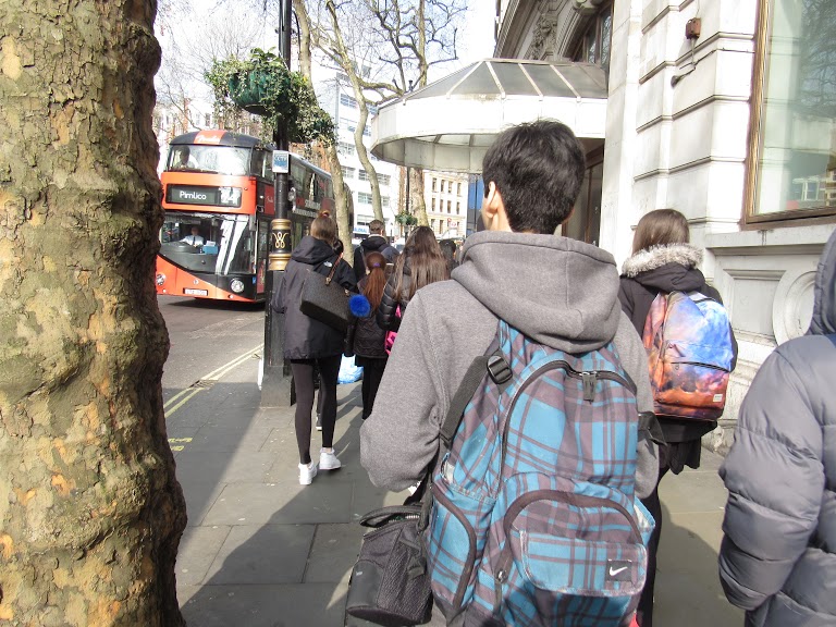
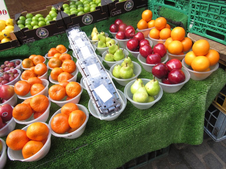
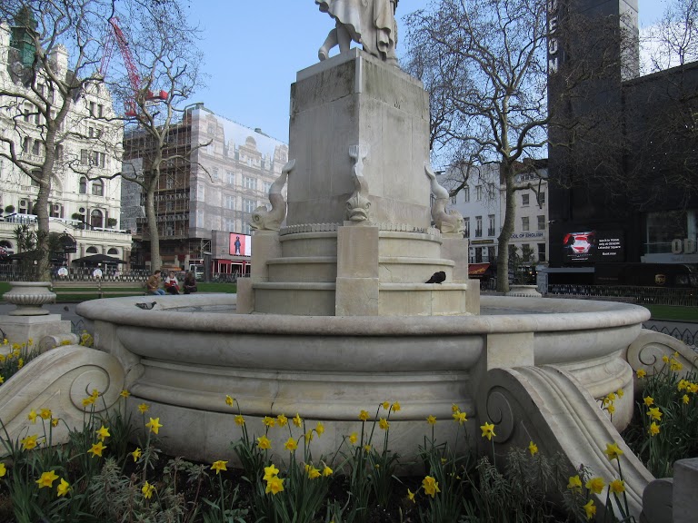
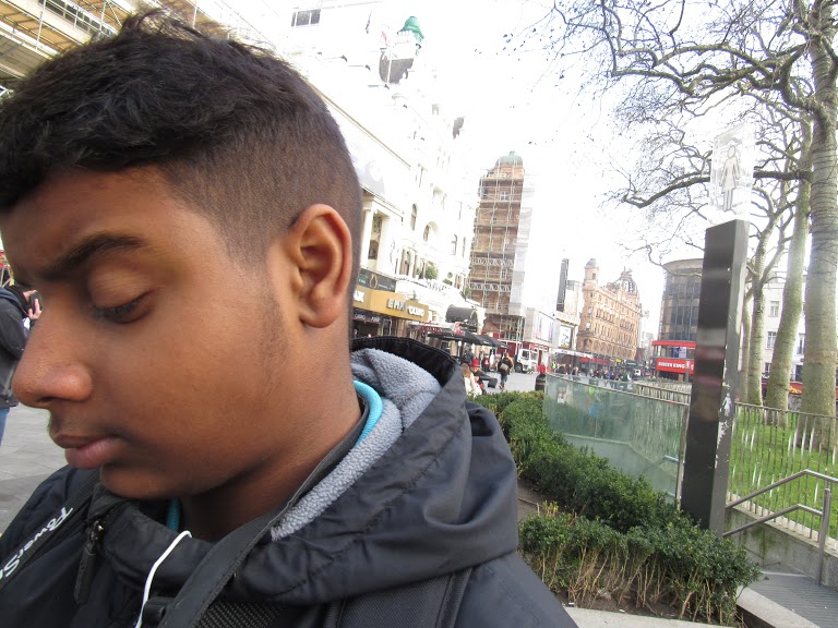
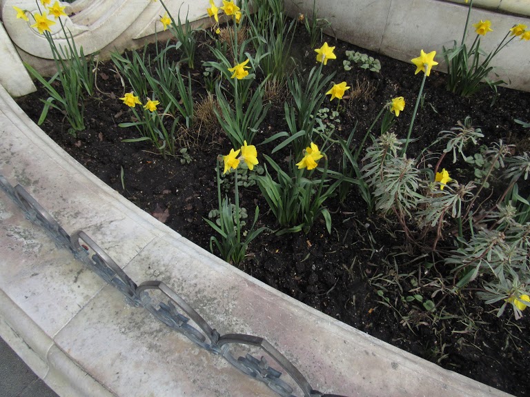
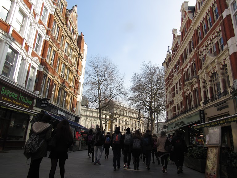
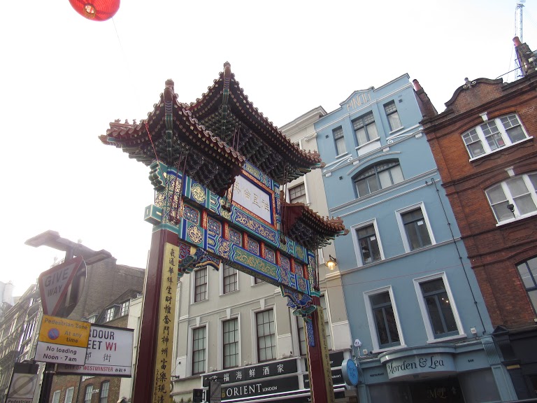
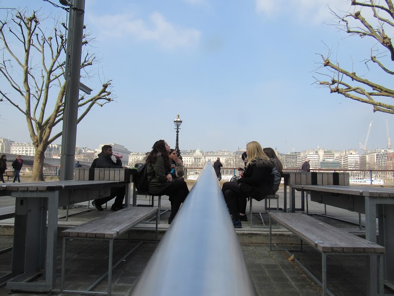
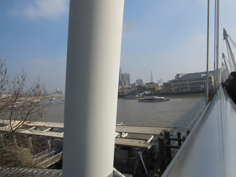
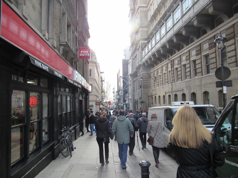
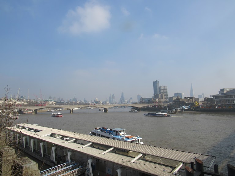
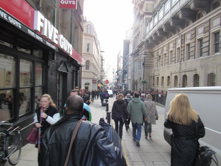
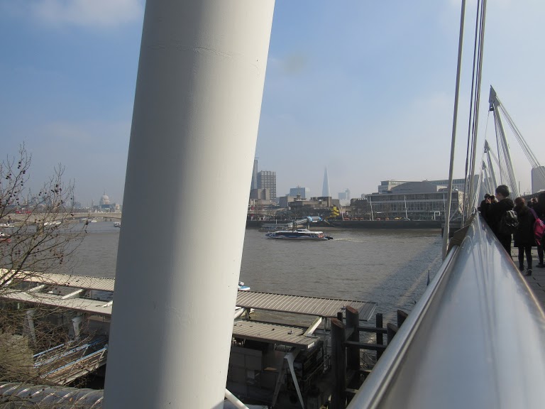
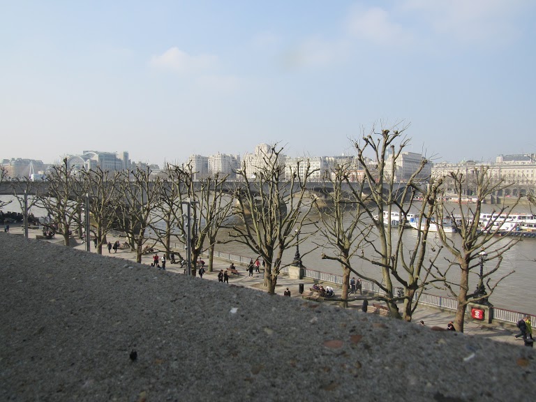
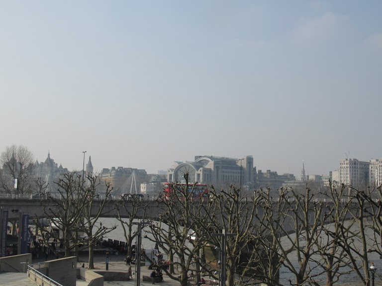
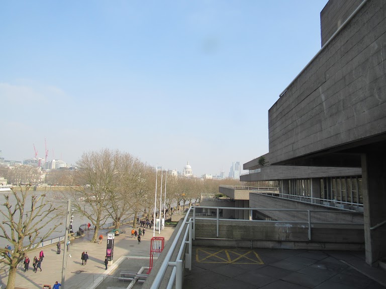
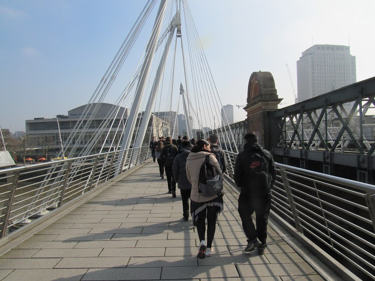
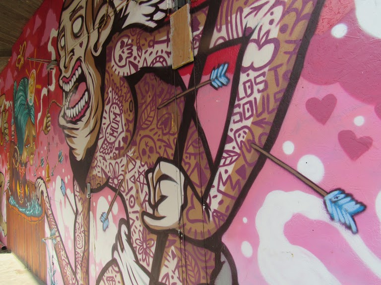
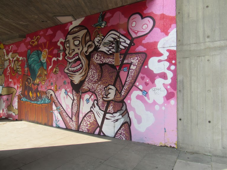
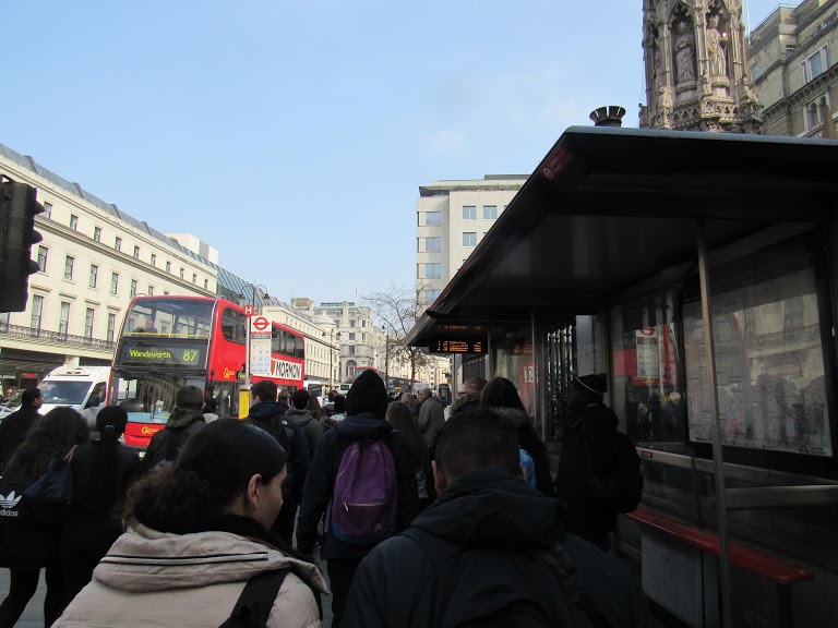
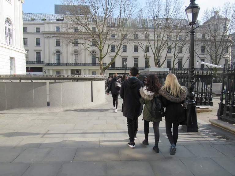
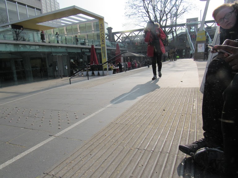
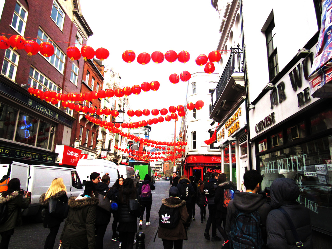
Photography trip.

The final pieces